In San Francisco, This Historic Light-filled House With a Modern Twist Is an Urban Refuge for a Family of Four
Sharing the same vision and respectful approach as the owners of this Pacific Heights home convinced Brooks Walker to work on the renovation. The couple—who has two daughters—trusted the architect to find the right property for their family, one with the greatest potential to fit their needs. After spotting and evaluating different options together, the owners and Brooks Walker picked an Italian Renaissance-style home that was built in 1925 and had remained mostly untouched.
“It was like a time capsule,” remembers Brooks Walker, who has been passionate about architecture from a young age, and is particularly influenced by the simplicity and precision of William Wurster’s works.
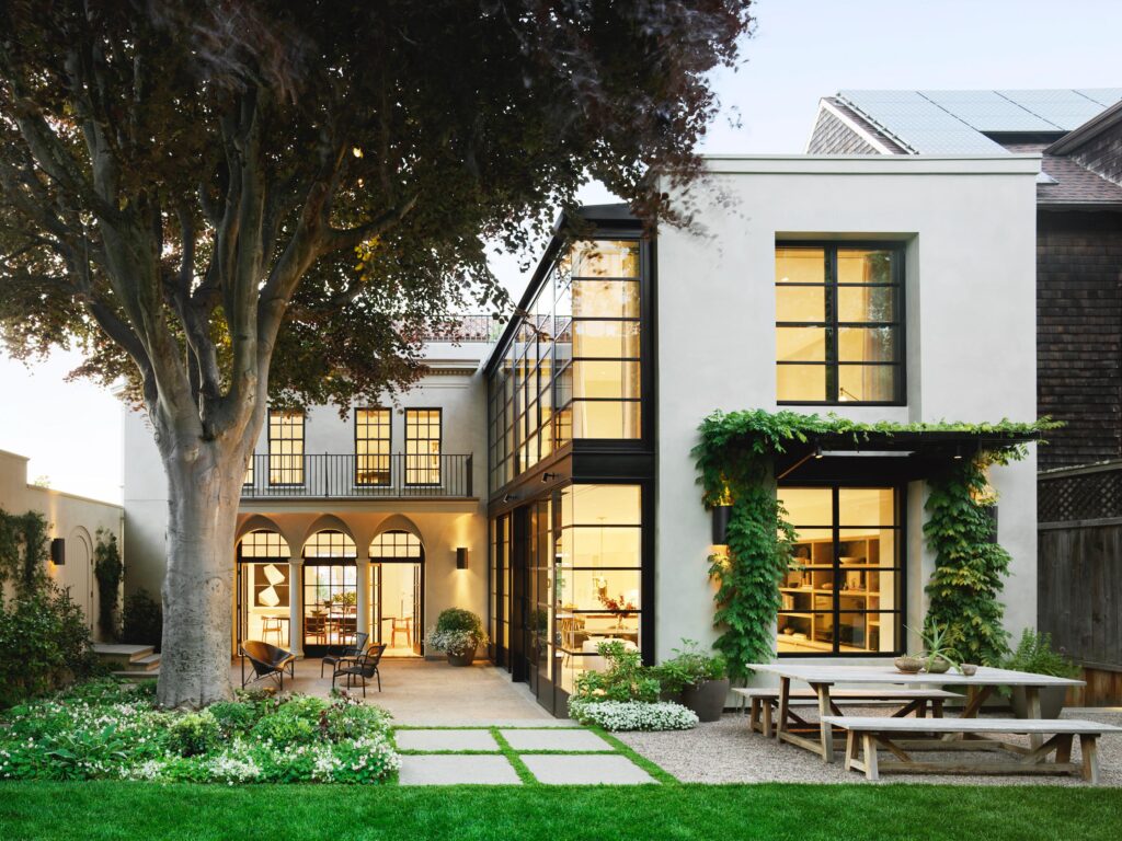
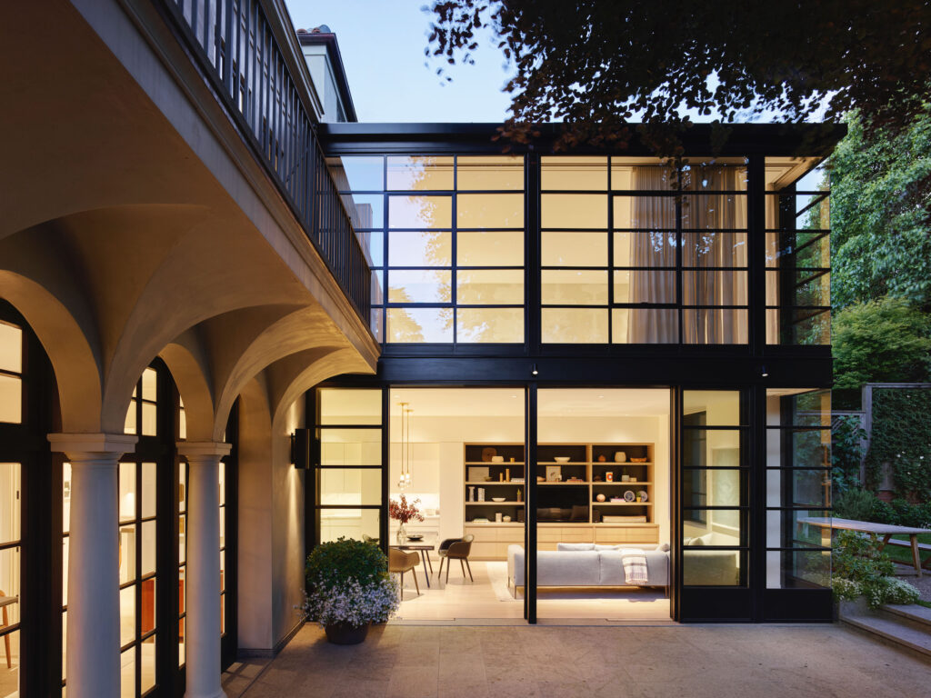
Before starting the remodel, the house underwent an evaluation due to its old character. The process resulted in the home’s qualification as a historic resource. “The report identified two and a half facades to the building that couldn’t be touched: the primary street facade, the side facade, and a portion of the backyard. The addition was designed beyond that, where the old kitchen used to be,” notes Brooks Walker. Respecting these rules meant clearly delineating the old and the new. To do so, the architect was inspired by what is usually done on the other side of the Atlantic.
“We ended up drawing inspiration from the historic London townhomes where you see the modernist interventions in contrast to the historic architecture, and it’s clear what’s what,” he explains.
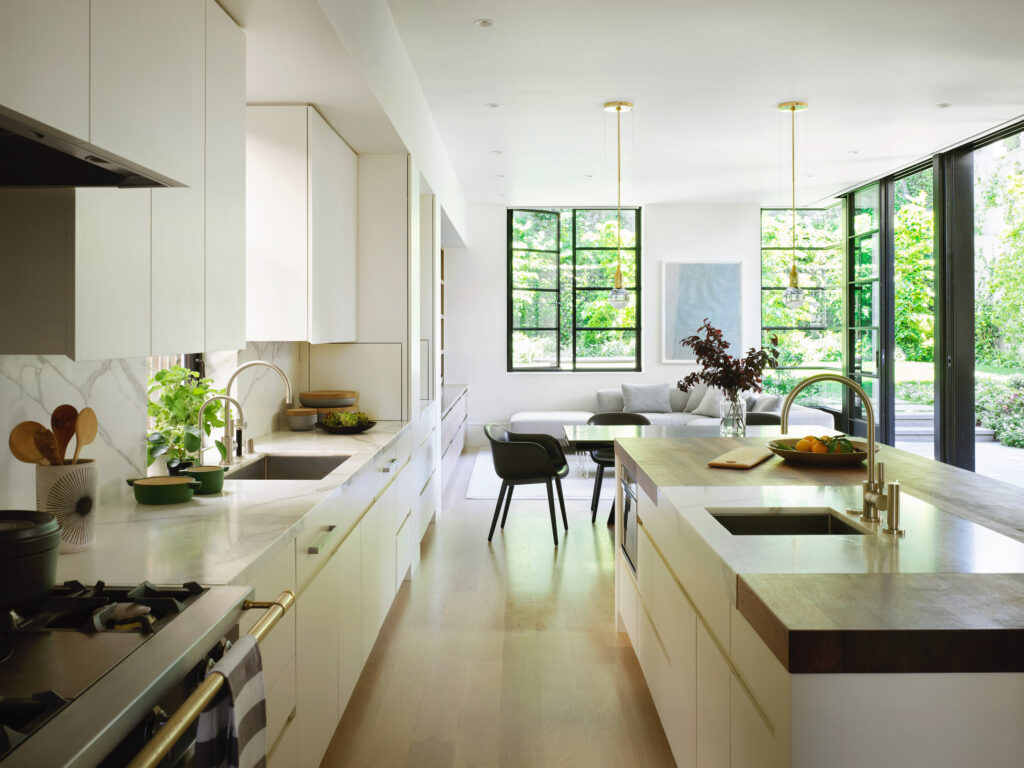
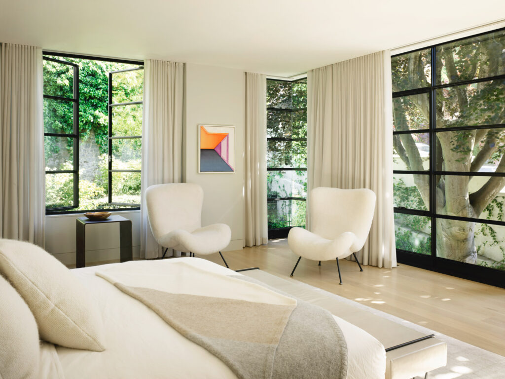
The new two-story, steel-cased glass box now comprises the open-concept kitchen, family room, and master suite. Technically, Brooks Walker and his team also had to bring the original house up to California’s earthquake code, which led them to remove the stucco and plaster exterior before adding steel to reinforce the foundation and putting in the new plaster.
“Our goal is to create well-designed architecture from durable materials that stand the test of time,” says Brooks Walker. “A building shouldn’t just feel right today; it should still feel right 50 years from now.”
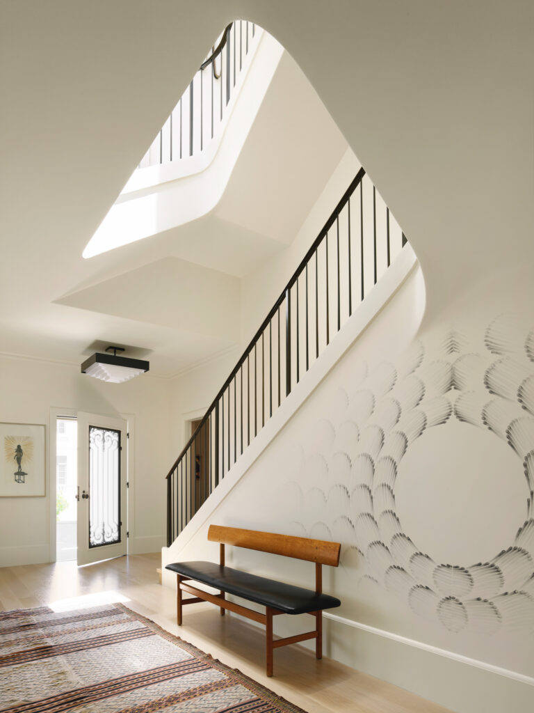
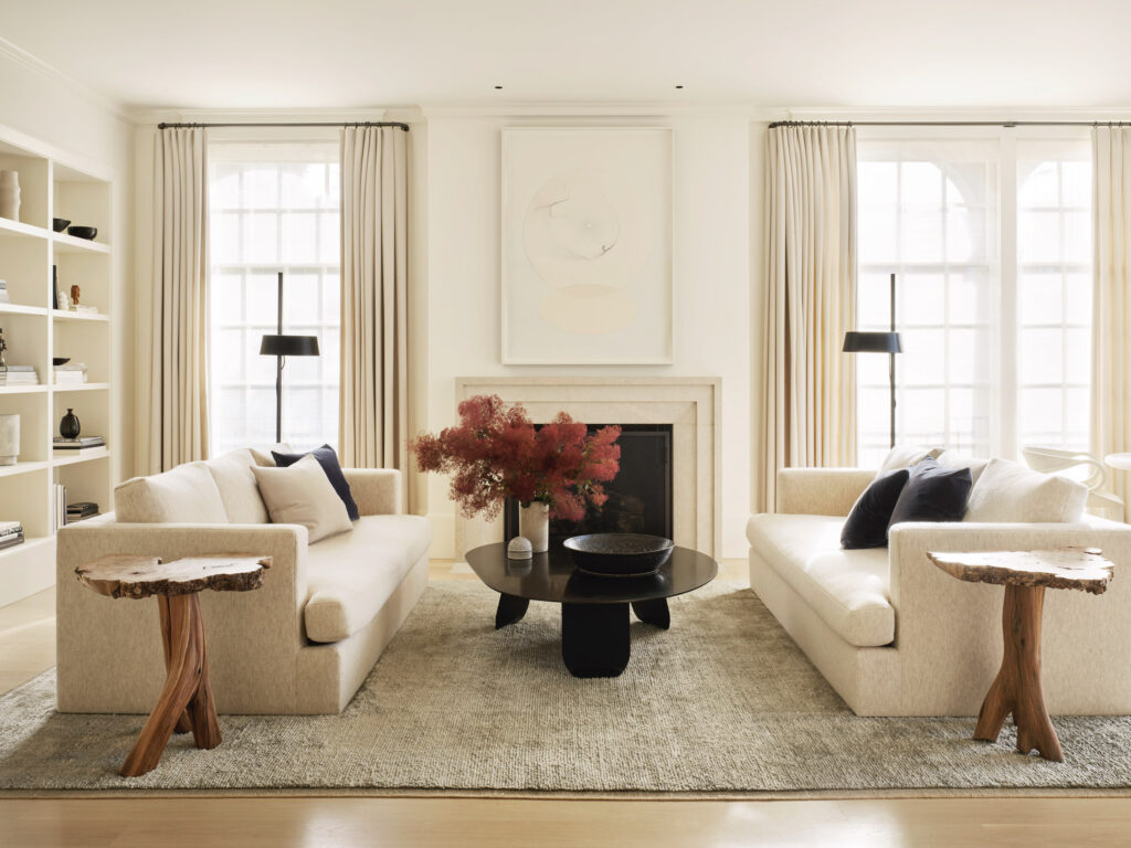
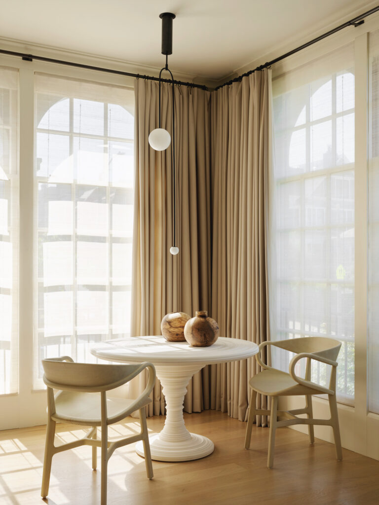
Adorned with a Judith Braun mural, the home’s original entry hall was kept intact in terms of size and layout. The living room, which hosts a cast plaster Rose Uniacke table, was also preserved. The family room, furnished with a comfortable B&B Italia sectional, was added, while the dining room—adorned with an Ilse Crawford brass console—was enlarged and connected to the rest of the public living areas through larger doors to provide a better sense of flow between all the spaces. Four bedrooms occupy the second floor while the fifth, which is located on the top floor, is currently used as a gym.
Inside, the challenge consisted of finding harmony while respecting the tastes of both owners. “The idea was to thread the needle between the husband’s very modernist sensibilities and the wife’s love of the historic elements of the house,” Brooks Walker confesses.
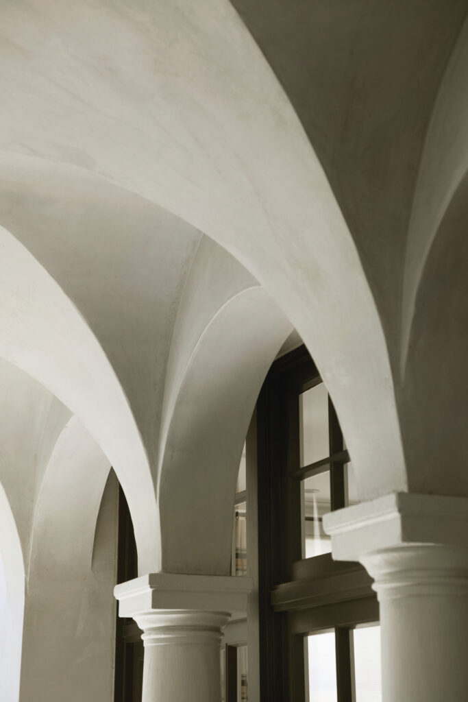
The moldings were changed to be simplified, and the decorative wooden cornices and columns were replaced with custom fiberglass reproductions, recreating the original architectural details. Interior designer Chloe Warner from Redmond Aldrich Design played a major role in finding the right balance between the owners’ aesthetics and creating the transition between the different spaces. She relied on muted tones (beige, gray, white, and cream) to shape the calm atmosphere.
“We used natural neutral colors; the joke was the house was done in ‘shades of a mouse.’ The owners wanted it to be textured and layered but not have the furnishings be loud in any way,” says Chloe Warner. Artwork supplies pops of color.
The large, south-facing garden designed by Scott Lewis Landscape Architecture—which is quite unique for an urban house in San Francisco—helps create an outdoor-indoor connection. In this charming outdoor area, the majestic, century-old copper beech tree is the focal point.
“The clients wanted to be near it, preserve it and feature it,” Principal Scott Lewis says. “We did everything possible to get the family literally close to the tree and under its canopy during their daily life.”
The architect made the most of this element, too, using it as a way to provide privacy for the master bedroom with its floor-to-ceiling windows that give the feeling of being in a treehouse.
Combining classic and contemporary style, this San Francisco home reflects a true sense of harmony, not only through its original architecture and modern addition but also in its peaceful interior spaces. It’s a house filled with natural light, thanks to a corner location and also to a big skylight that Walker Warner added at the top of the stairs, and one where every element seamlessly merges with the other, joining together past and present and laying the foundation of the future of the house.
Walker Warner Architects | walkerwarner.com
Photographs: courtesy of Matthew Millman
