A Pat Killen home showcases South Bay modernist style while optimizing light, views and everyday living
Written by Constance Dunn | Photography Courtesy of Paul Jonason
Presented by Meredith L. Johnson of Vista Sotheby’s International Realty and Mark Kitching of Partners Trust
List Price $4,995,000
A few years ago, an East Coast couple newly relocated to California was mulling a move to the South Bay. Drawn to the area’s natural beauty and family friendliness, they made up their minds on a Friday night dinner visit to a tucked-away neighborhood in Hermosa Beach. “We were at a friend’s house one street over,” says Beckie Stoddard from the 25th Street property in the Sand Section. “We watched the sunset and said, ‘Oh my God, we love this area, and specifically this neighborhood.’”
At the advice of their friend, the couple returned the following day to peruse the place more closely and see what might be available, particularly as their friend told them that so desirable was the neighborhood—peaceful, a short stroll to the beach or park, and off the main roads—that a lot of properties were scooped up before making it to the open market.
The next day, a new home under construction on a free-floating wedge lot on a hill, bordered on three sides by quiet, residential streets, immediately caught the couple’s eye. “The builder [Kim Komick of KKC Development] came over on her bicycle and took us on a tour,” says Stoddard. The couple decided to take it, and quickly.
CLASSIC PAT KILLEN
 A reason for the Stoddard’s rapid-fire “Yes” had much to do with the home’s design. Lovers of architecture, and Modernist architecture in particular, they learned that none other than Pat Killen, a founding father of South Bay Modernist architecture, designed the home. (Killen, who passed away in 2015, began designing Modernist homes geared around beach living during the 1980s, and among his residential works are glassy, geometric structures like Shearin House on the Manhattan Beach Strand and the Beach Pod in Hermosa Beach. Community projects include La Marina Preschool and the 9/11 Memorial for Manhattan Beach.)
“This house is a completely different style than what you’re seeing in the market right now,” explains real estate agent Meredith L. Johnson, “especially in the new construction that’s happening in the Beach Cities. A lot of new construction is either Contemporary or Plantation-style homes, and this is a very distinct modern home.”
The Stoddard’s home, completed in 2013, is an angular, serious work of Modernism—3,690 square feet in all, with another 700-plus for a bounty of outdoor living spaces, including a breakfast deck, rooftop patio and fresh-air lounge. “This house really is classic Pat Killen,” says Stoddard. “He did Beach Modern like no one else. That’s why we fell in love with this design.”
AT THE PERFECT TIME
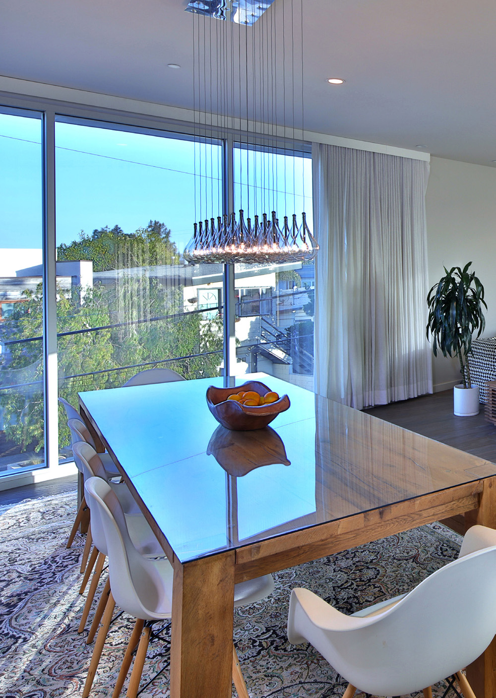 The triumph of the home has much to do with how the design is meticulously shaped to the lot and the natural elements that surround it. On the second floor, which functions as the heart of everyday living—kitchen, dining and lounging—there is no spot you can stand that hasn’t been sculpted for optimum views and poetic, dawn-to-dusk sunlight.
The fenestration (the way the glass and windows are organized) is the result of a hyper-keen study in how the home would intake light at various times of the day, based on where one might be at a particular time. For instance, the dining area is prime for morning light (“My kids sit here and they have their breakfast while the sun rises,” notes Stoddard). Sunsets are epic when viewed from kitchen and the 360-degree rooftop patio—which has ocean views that stretch from Palos Verdes and north to Malibu.
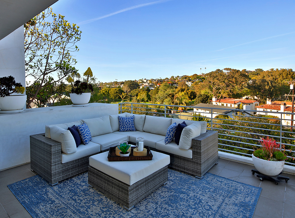
The family favorite, though, is the mellow lounge the Stoddard’s playfully dubbed The Lido Deck. Suspended amidst old-growth trees and nicely shrouded from the street below, with grassy views of neighboring Valley Park, the space is home to the best of all scenarios. “In the morning you hear the birds, in the afternoon you hear kids laughing and in the evening it’s just peaceful,” says Stoddard. From this perch one also enjoys the serene views of surrounding Hermosa valley, a hilly expanse studded with homes. It’s almost Mediterranean in its visage, and it turns a brilliant orange-pink glow at sunset. “The light hits at the perfect time. Our favorite thing is to hit these outdoor areas at different times,” says Stoddard.
GOOD FLOW AND GREAT USE
 It’s a remark that no doubt would have pleased Killen, who, speaking on architecture in a 2010 video, described the need for a micro-analysis of land and lifestyle in order to provide a fully optimized design: “You have to spend a lot of time thinking about the property, thinking about how to utilize it. Where the sun angles are, where you want to wake up in the morning.”
To this end, highlights of the home’s floorplan include a ground level that houses all four bedrooms, and twines privacy with light and outdoor spaces. The sunny master suite is complete with a marble-filled bathroom, and stands adjacent to an entranceway courtyard, with plenty of sliding doors and a wall of windows. “Laying in bed you see the whole hilltop, it’s really beautiful,” says Stoddard.
Across the generous foyer is a bedroom wing—convenient for children, or for use as a trio of rooms dedicated to creative work, fitness or study. A gated side yard and plenty of access to the outdoors is a nice plus.
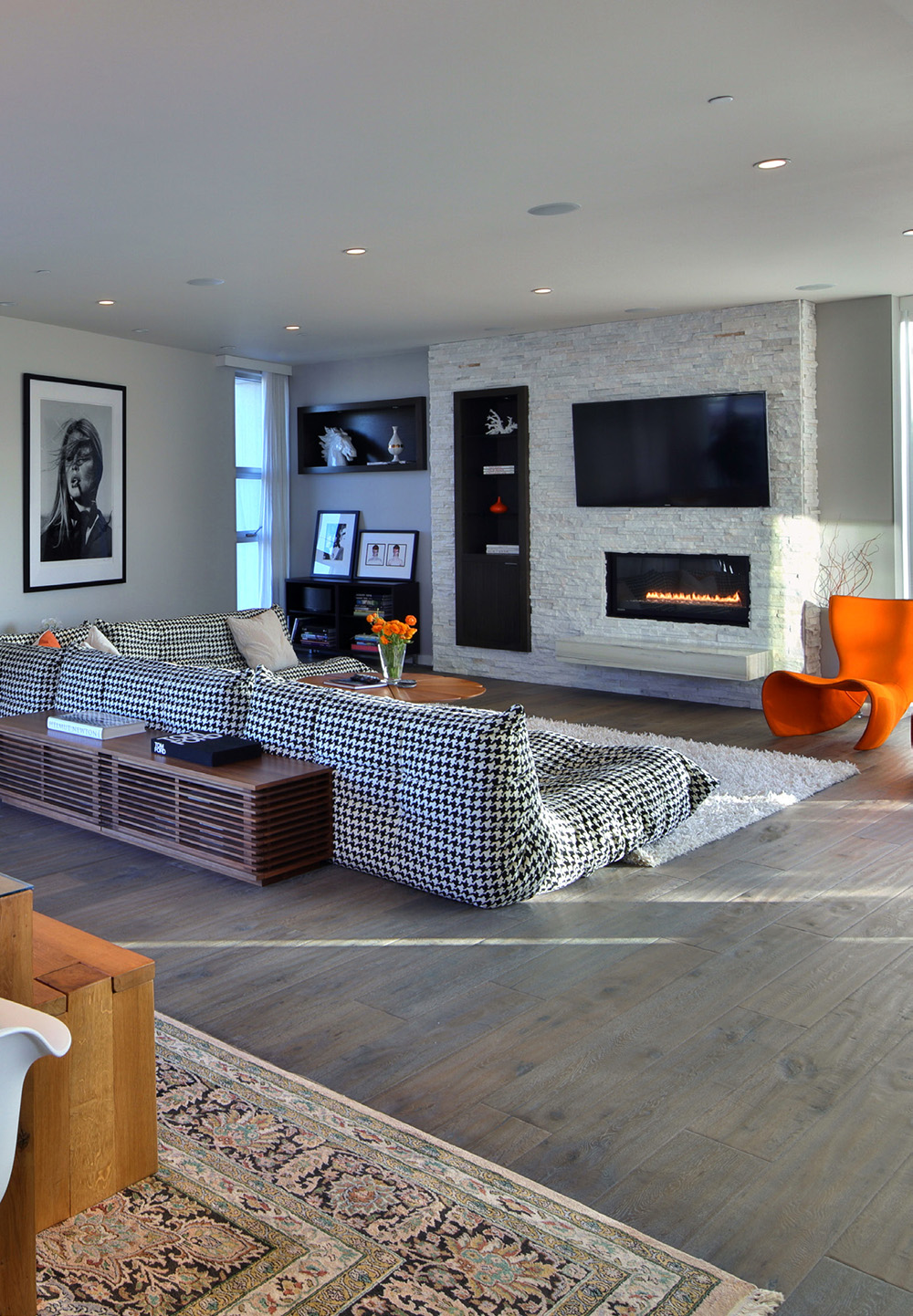
Framed inside a gated courtyard, the entrance to the home is dramatic, greeting one with a judicious mix of metal, wood and glass. Once inside, a 30-foot wall of stacked stone serves to aesthetically unify the two levels, adding a note of low-key glamour while providing additional natural light via a series of geometric windows that strategically shuttle in sunlight. “It’s quartz,” Stoddard explains. “It has a little shine to it. When the sun hits it, it’s really shimmery.”
“He did Beach Modern like no one else. That’s why we fell in love with this design.”
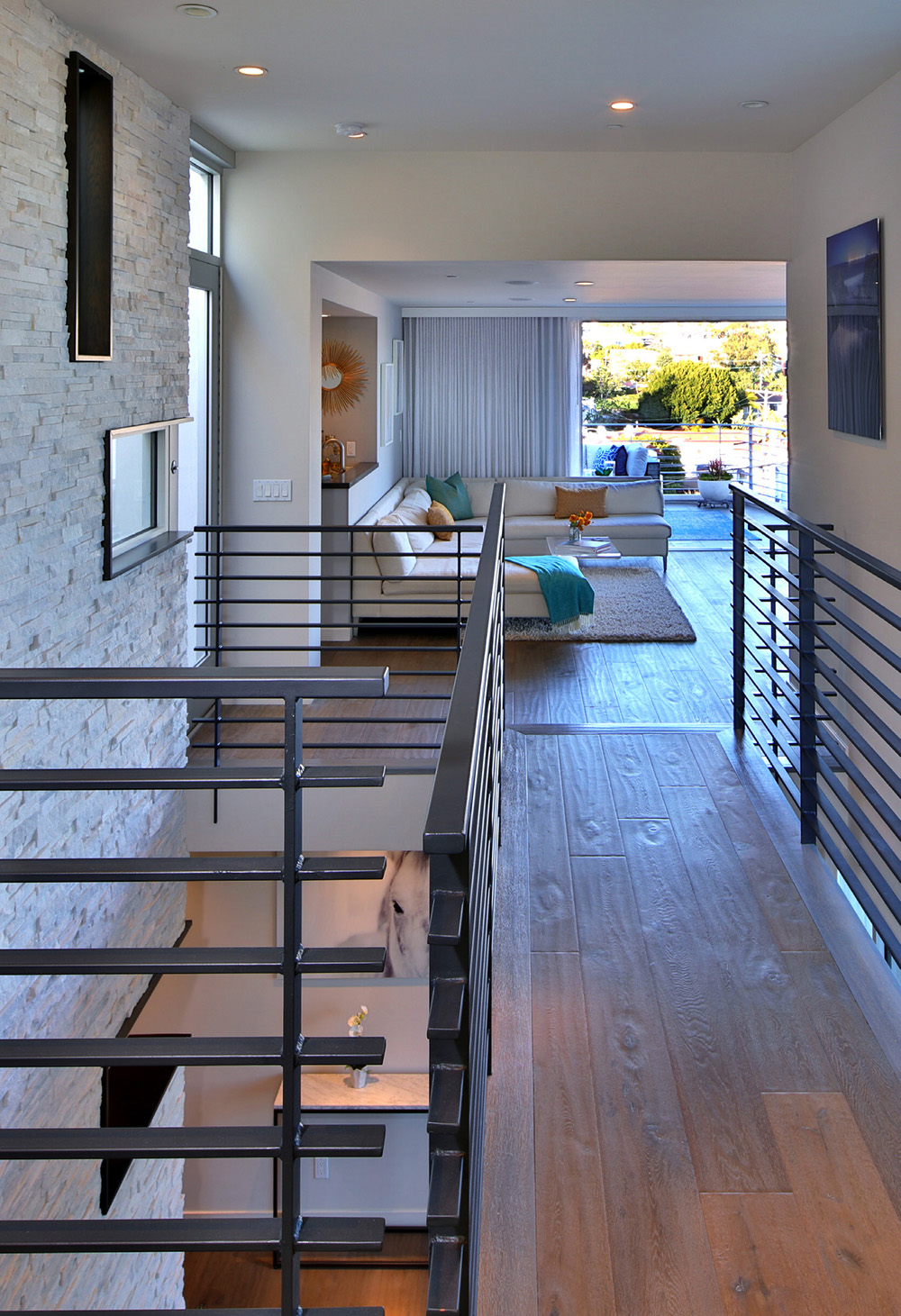 The main living floor adheres to an open floorplan concept, yet spaces are made distinct by way of skillfully subtle angles, textures and ceiling elevations. A catwalk separates the great room from what the Stoddards call their “ultimate family room,” a super versatile space that functions as a media room, playroom and social gathering spot—the latter boosted by a bar and open-air lounge. “Even though it is so modern, it still has good flow and great use,” notes Johnson.
Ultimately, it’s a combination of utility and art that makes this home so distinctive, along with the architect’s positive exploitation of the natural bounty that surrounds it. Speaking to Easy Reader News in 2010 for the article “Decade in Review: Architecture,” architect Pat Killen summed up a guiding principle of his work, the fruits of which have been positively netted in this home: “Sometimes we need to labor over things and get a better result, a better quality of life, and a better environment in which you get to live in.”
