Using Raw Materials to Emphasize a Series of Surprising Geometries, Transdisciplinary Design Firm SAW Goes to the Residential Middle in Mill Valley
Transforming a 1962 house, with a floor plan from its period, led San Francisco-based design firm SAW // Spiegel Aihara Workshop to reconfigure its core, thereby expanding its residential horizons. Going straight to the heart of the matter, the firm left the footprint of the two outermost structures intact, despite their rotated geometries, and found new ways to stitch the middle of the home back together.
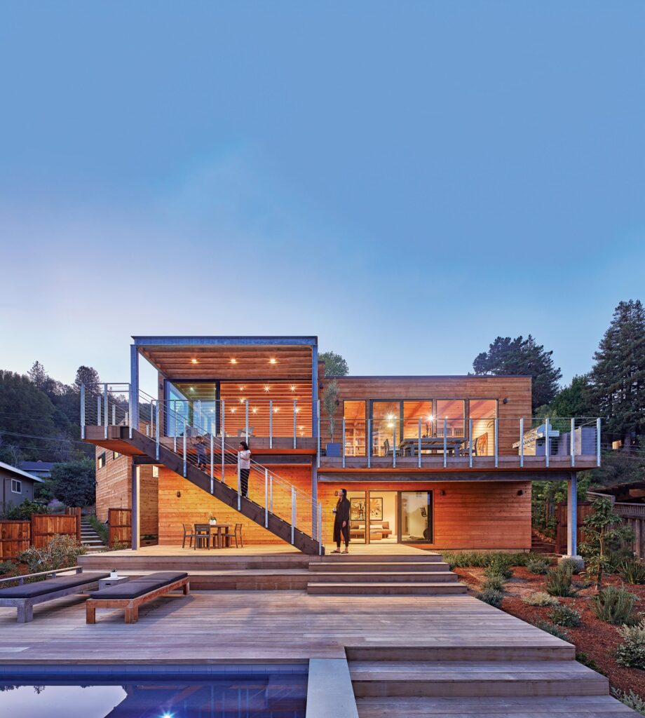
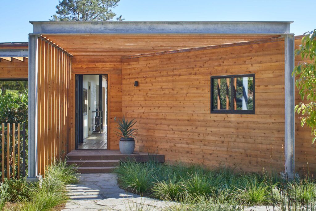
The result is The Middle Half, an open and light-filled dwelling with a direct connection to the landscape and layered geometries highlighted by raw materials of galvanized steel, cast-in-place concrete, and rough-sawn cedar.
“We are a hybrid architecture and landscape architecture studio,” explains Dan Spiegel, principal of SAW, “so each project—and especially this one—is about creating dynamic connections between the interior and exterior and using these connections to animate movement across different times of day, creating new and unexpected interactions between people within these spaces.”
As a firm, he continues, “We are interested in organizations of people, things, and materials—where they come together, and where they diverge.”
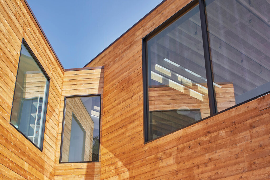
This project, then, is “about building up and exposing layers, celebrating systems of structure as finish, using conflicting geometries to promote interaction, and engaging the landscape to expand the limits of architectural space.”
Like many homes of the mid-century era, which are highly prized pieces of history but almost always in need of reforming for optimal contemporary living, the original 2,746-square-foot residence featured what SAW describes as “a segmented layout of small rooms and a highly congested core.”
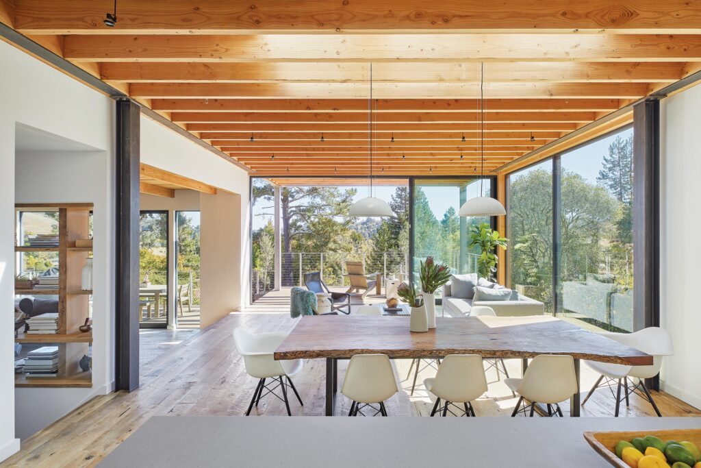
To work around the home’s “organizational flaws,” the firm enlarged the space to 3,457 square feet, unchaining it from its layout to create an open-plan central living space in dialogue with dramatic views.
“It’s meant to be perceived as a building that is both low and extremely high,” says Dan Spiegel of the structure, which, in reference to its mid-century roots, keeps a low-slung horizontal profile from the street.
Bringing it into the modern era meant maintaining “most of the structures on the two outermost sides of the project, working with the existing outermost edges of the perimeter, while tactically removing excess overhangs and eave structures, and recladding the entire exterior with rough-sawn cedar—a material that is both traditional and contemporary,” explains Spiegel of toggling between past and present.
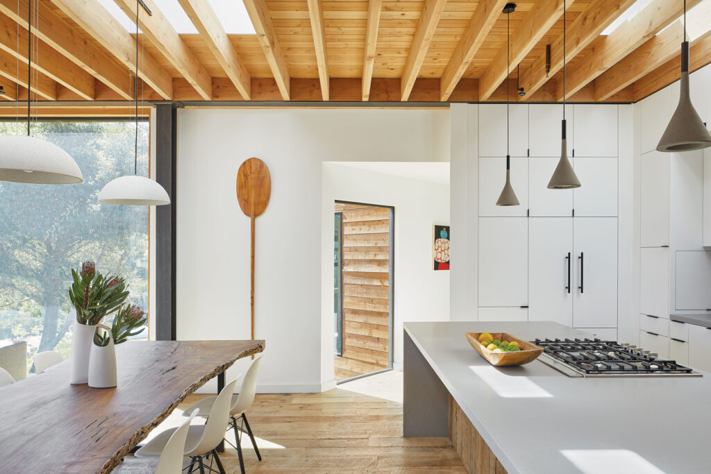
“In the interior of the remaining structures,” he continues, “we sand-blasted the existing exposed beam structures to feature the old structure, but stripped of paint and other concealing surfaces, and celebrated both finished and structural materials.”
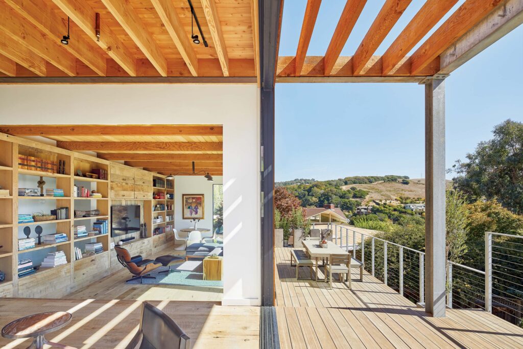
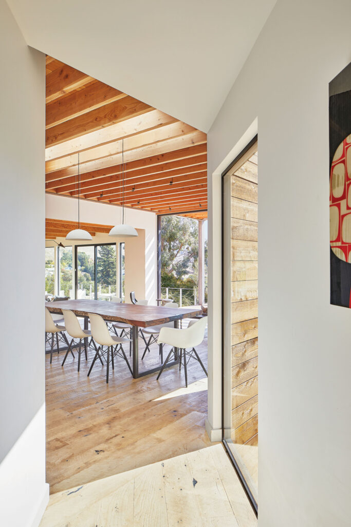
Central to the house is its idyllic alliance between indoors and out that SAW sought to exploit, starting with creating a clear sightline from the entry to the rear deck that not only links the home’s communal and private spaces, but also fosters a sense of expansion as it moves toward the valley-facing rear yard.
“While the entire home is an exercise in blurring distinctions between interior and exterior, this reaches its fullest expression at the rear,” says SAW. “The kitchen-dining zone spills without interruption into living and family rooms bordered by floor-to-ceiling windows and glass doors that open to the suspended upper deck, implying layered continuity.”
The rear landscape is itself volumetric, with a wide upper deck connected to stepped lower decks and terraces staggered as “landscape rooms” across the slope, with steel and wood beams and columns helping to frame the views as pictorial.
Inside, homeowner and interior designer Kina Ingersoll sought to replicate her nature-centric upbringing in Hawaii.
“I wanted our house to exhibit all of these inspirations,” she says. “A connection to nature, with large back doors opening to our yard and the surrounding woodland surroundings, and an interior that exhibited a subtle mix of cultures, from old world to new world, Eastern to Western, and modern to traditional.”
To that end, she points to the live-edge dining room table.
“We sourced the slab of black walnut from an East Coast lumber company on Etsy, and then we hired a local woodworker to finish it and a local metalworker to build the raw steel legs that I designed.”
From exposed-beam ceilings and crisp-white gypsum walls to floor-to-ceiling white millwork, the home strikes a clean, straightforward tone, bringing forth views seen through vast amount of glass that, along with being an aperture, is a sieve for natural light highlighting SAW’s architectural improvements and connections.
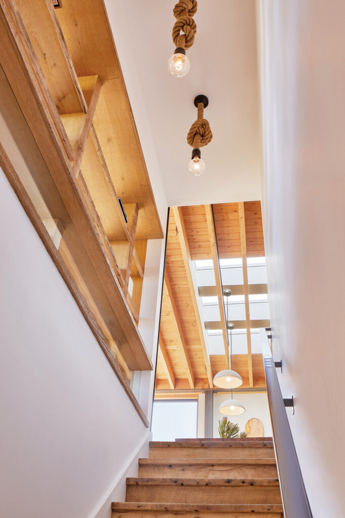
On one side of the kitchen, for example, is a stairwell that “slides subtly behind the family room’s open bookshelf down into a lower level bar/lounge, guest room, and office,” states the firm, noting the conspicuous absence of an interior connection between the upstairs and downstairs previously.
“The lounge also features glass floor-to-ceiling sliding doors that open onto the lower deck.”
In pushing a mid-century house past the boundaries of what its bones once allowed, SAW opened up more than a residential core. It expanded the perceptions and possibilities of old architecture in a new age.
SAW | sawinc.com
Photos: Mikiko Kikuyama


