Table of Contents
A Skinny Lot Becomes an Oasis of Fresh-Air Living
Where | Manhattan Beach, CA
Who | Ras-a, Inc
Photos | Chang Kyun Kim, Courtesy of Ras-a, Inc
When Robert Sweet was asked to design an up-to-date residence on a lengthy, slender South Bay lot, where a late-1920s home once stood, he decided to start wholly anew.
“We took the original home down to the foundation, with maybe a one perimeter wall,” he says, “then recycled the foundation to the new house to keep some of the lineage of the original structure.”
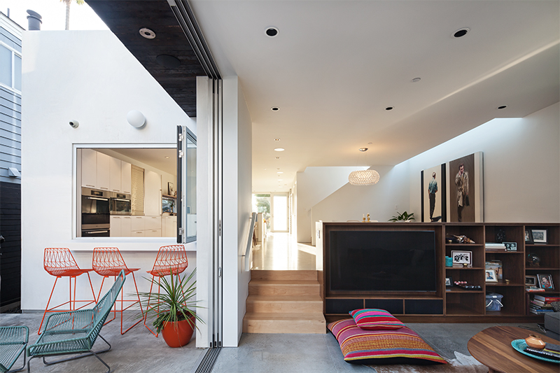
The end result is a smart-looking Modernist place that skillfully encases open-air gathering spaces and pipes in sunlight via strategically placed windows and skylights, plus a central courtyard.
“Most of the lots in the South Bay are relatively narrow, but this one was exceptionally long,” notes Sweet.
At the front, the home is all smooth, angular stucco, but move along and you’ll find hearty, cedar-plank cladding along the generous private courtyard—carved from the interior and onto which all public rooms open. The courtyard is replete with dining and lounging spaces and primed for year-round use by way of a radiant floor system. A snack counter, an outdoor shower and a fireplace—the latter built from patio bricks used in the former home—are charming outdoor touches, while inside, perks include a sauna and steam shower.
A 21st Century Refresh For a 1950s Ranch Home
Where | Rancho Palos Verdes, CA
Who | Ottolia & Barnes Architecture, Patterson Custom Builders
Photos | Paul Jonason, courtesy of Patterson Custom Builders
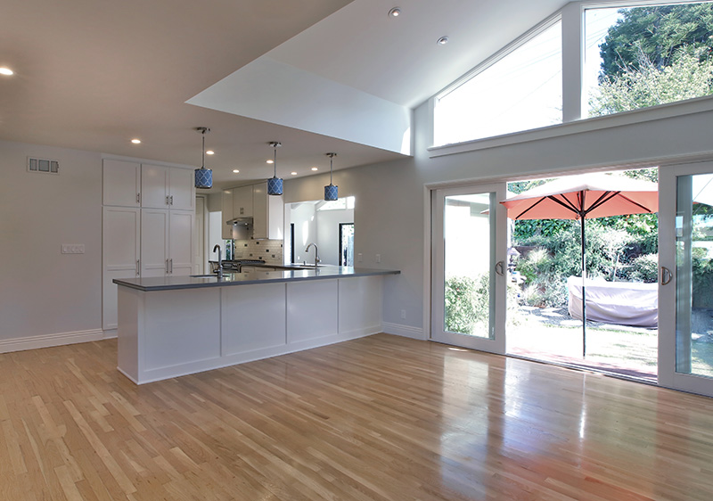
It’s a familiar tale: Family purchases a post-war ranch-style home in a great neighborhood. Family expands and the home’s floor plan—a yesteryear scheme of small rooms separated by fixed walls and tiny doors—starts feeling constricted and cramped. Ottolia & Barnes Architecture designed, and Patterson Custom Builders executed a sunny update to this mid-century home by fusing the kitchen, dining room and living room in order to open the flow of traffic and “create a unified, finished space that a family of today can use and enjoy,” says Aaron Patterson of Patterson Custom Builders.
An exterior wall was extended, adding 20 feet of additional living space to the mix, complete with vaulted ceilings, glass doors and a massive transom window to stream in natural light and views of outside greenery. Old and new spaces were visually fused by matching new wood with the original red oak floors, then finishing both to a high gloss until they were a perfect match.
The kitchen was refreshed with new appliances and custom cabinetry featuring alder wood on the exterior, finished with fresh, white pigmented lacquer.
“It adds durability and is silky to the touch,” says Patterson. “Plus, it’s easier to keep clean than paint.” A utilitarian countertop, modern and spacious and made of engineered stone, was added. (“It’s a good choice for families,” remarks Patterson. “It’s more durable than ‘real stone,’ plus it resists cracking and staining.”)
A Modern-Day Annex Made Easy
Where | Los Angeles, CA
Who | JoT House, Inc
Photos | Courtesy of JoT House, Inc.
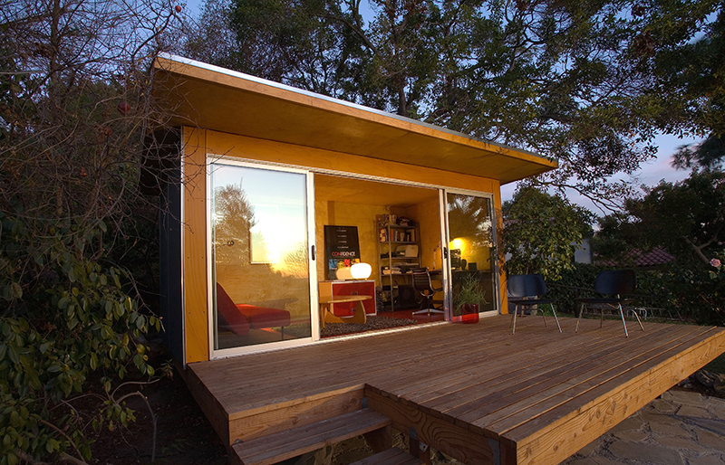
Inspired by the stripped-down beauty of Joshua Tree National Park, and a series of efficiently minimalist homes he designed in the area for a client, designer Bryant Yeh created a micro-house system called JoT House. Shown here is the Mini JoT, which starts at $45,000, and can come delivered on a flatbed as a finished unit. (Thinking it might make a nice trailer? Put the Mini JoT on axles and away you go.)
The Mini JoT measures a tidy 250 square feet and functions beautifully as a spare room or a creative studio.
“We wanted to keep it as simple and clean and no-nonsense as possible,” says Yeh of the design. “It’s natural, and you don’t think about it.”
Perfect as a sunny getaway for those who do their best thinking out of the fray of their everyday home scenery, the Mini JoT features a tough, no-maintenance exterior of either laminated wood veneer or fiber-cement concrete—purchasers’ pick. There are earthy finishes and modern fixtures on the inside, and clients can go standard or customize its colors and other details. Yeh has even been known to add extras, such as operable glass along the front and decking along the edges.
“It’s flexible, and you can do a lot with it,” says Yeh, before adding modestly, “I think it’s a good system.”
A Craftsman Skillfully Remodeled to Make Way for a Baby
Where | Berkeley, CA
Who | Workshop 30
Photos | Ramona d’Viola, ilumus Photography & Marketing
A modest one- or two-bedroom apartment measures approximately 750 square feet—the same size of the classic Craftsman home shared by Cliff Williams and Ashley Turner. Cozy but doable, that is, until baby came along. It was then that Williams, a digital designer, and Turner, an architect, embarked on a quest to expand their home while keeping its facade faithfully intact.
“We basically gutted and reorganized the interior,” says Turner. This included adding just under 300 square feet inside with a smartly reconfigured floor plan.
The new scheme? Create two halves. One section includes two bedrooms and a living room; the other a big pantry and a laundry room, plus an expanded kitchen and dining area.
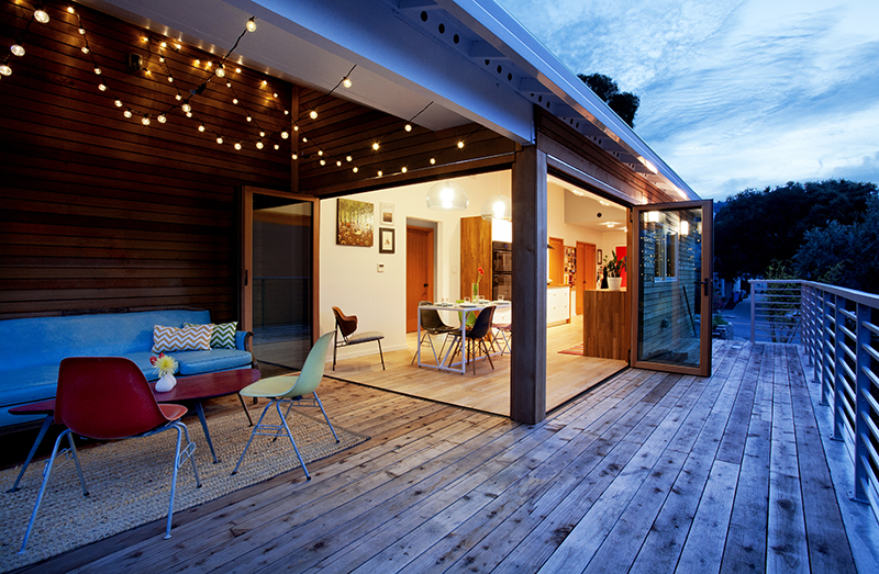
“The original kitchen and bath were the same size,” recalls Turner, “About 6 by 8 feet!” Additionally, a 260-square-foot redwood deck was added. “About 100 square feet of the deck is under a roof between the kitchen and yard. We call it ‘The Outdoor Living Room.’”
Lastly, special attention was given to landscaping, with stone pathways and discrete sitting areas fashioned throughout the backyard, which is relatively large thanks to the modest footprint of the house.
The remodel has worked well for the family, with memories of their shared design project a bonus for Williams and Turner.
“We are both designers, so designing a home together will always be special to us as a couple,” says Turner.
