Table of Contents
A Kaleidoscope of Palette-driven Projects Highlights Contemporary Design at Its Most Vividly Realized
The center of a new arts quarter by 6a Architects in Milton Keynes is a shining example of the boldest vision imaginable.
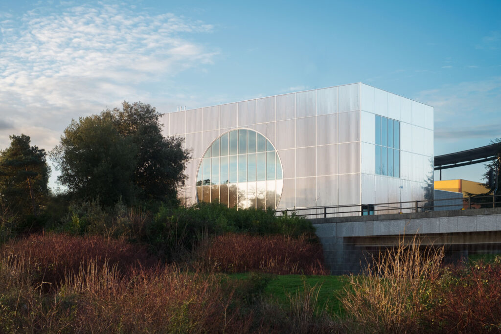
Conceived as a utopian urban project in the late 1960s, the English town of Milton Keynes is ever-growing in its ideals, aesthetics, and architecture, most recently with an example of all three, MK Gallery overhauled and expanded by London-based 6a architects.
MK GALLERY
Working in collaboration with artists Gareth Jones, Nils Norman, and graphic designer Mark El-khatib, 6a architects designed MK Gallery’s gleaming, a rectangular-shaped expansion that is wrapped in a skin of corrugated stainless steel and punctured with a gigantic circular window facing the landscape.
Simple in form, MK Gallery is a product of complex architectural thinking meant to reflect “the rigorous grid that underpins the city, once a playground for British modernists and the early pioneers of High-Tech,” according to 6a Architects. In this, the project is a thoughtful homage to, and update of, Milton Keynesian principles.
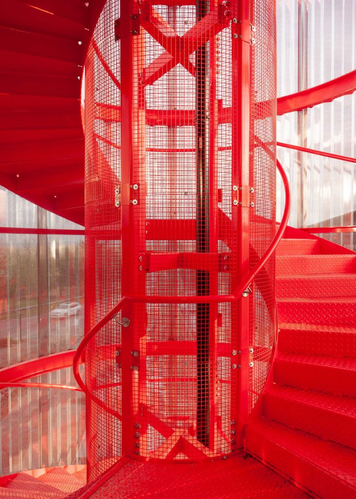
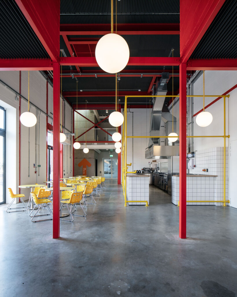
The building’s glossy façade shifts from opaqueness to something truly illuminating inside: an axial arrangement of equally contemporary galleries and public spaces, including an auditorium and a bar and café. Interspersed throughout the otherwise toned-down exhibition space is a riot of red and yellow.
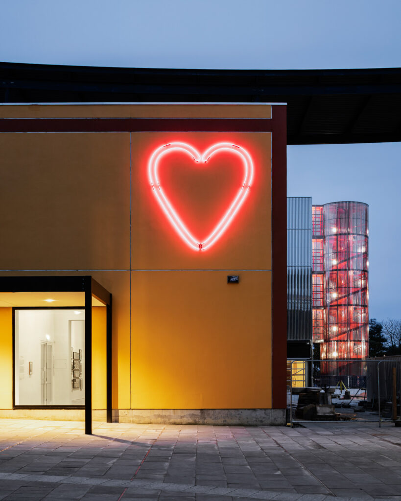
Selected to evoke a 1970s mood—and pulled from color charts of that era—the rich primary colors are judiciously applied, creating a canvas of contrasts equally suited for showcasing a rotating program of international contemporary art, and for experiencing it as well. Outside is likewise artful with a playscape and garden. In assembly, aesthetics, and architecture, MK Gallery stands as a dynamic tribute to a city based on dynamism itself.
MK Gallery | 6a.co.uk
Photographs: Johan Dehlin, Courtesy Of 6A Architects
MI VIDA
Boutique design firm 3877 Design brings fresh flavor to Washington DC with an exuberantly designed, palate to palette eatery.
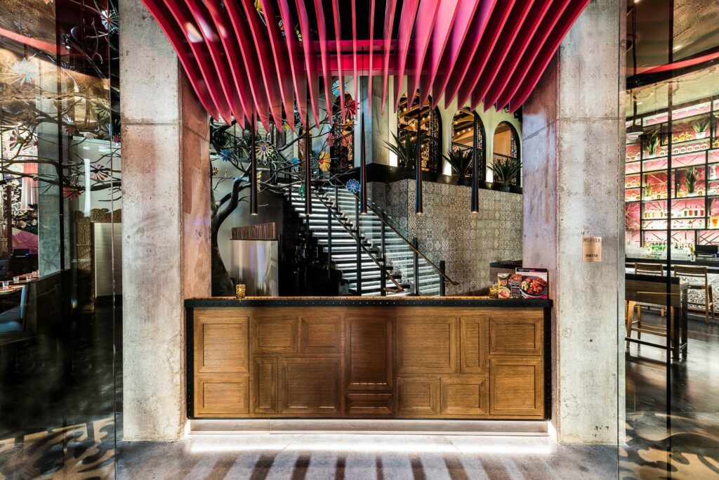
It’s a fever-dream of a place where pops of pink and shimmering rose-gold metals give luster to neutral tones and tile. Located in a trendy sector of Washington DC, with a prime perch in view of the Washington Channel, the 9,766-square-foot Mi Vida is modern Mexican to the core, both the menu and the vibe. It’s a spicy and eye-catching environment, thanks to the hacienda-style design featuring contemporary architectural details and materials.
That the concept is cohesive rather than chaotic is a credit to collaborators, design studio //3877 and KNEAD Hospitality + Design. The partnership infused Mi Vida with an effervescent Mexican spirit and au courant character via custom elements (bright pink fins designed via parametric software, hand-carved concrete panels, metal screens, and railings) and traditionally atmospheric touches (fire pits, a low-lit bar, floor-to-ceiling windows).
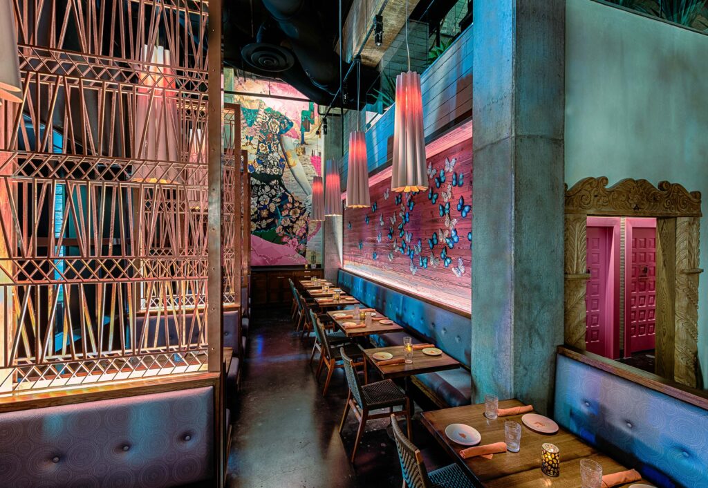
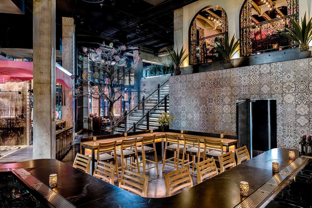
Everywhere are moments of surprise and delight: the Árbol de La Vida, or “Tree of Life,” anchoring the central dining room, a series of hand-painted, wall-mounted butterflies leading the way to bespoke booths and banquettes, a painting of a traditionally costumed dancer, and a room that draws drama from glittering chandeliers and succulent-patterned wallcoverings.
These components and others, like arched openings and an alfresco dining space, transport one to the smaller enclaves of colonial Mexico, while the cutting-edge steel staircase of floating wood treads and a glass handrail reflects the country’s contemporary side.
It is this balance—between aesthetic taste and architectural restraint, Old and New World design—that makes Mi Vida a feast for the eyes.
3877 Design | 3877.design
Photographs: Courtesy Of //3877
ASMUNDO DI GISIRA
Looking to the symbol and shades of an ancient Sicilian city, Studio GUM imagines a vivaciously drawn hotel.
In Catania on the island of Sicily, Studio GUM transformed a private noble residence into the boutique hotel Asmundo di Gisira, animating it with a uniquely folkloric intervention.
By “reading in a contemporary way” the stories of their lives, Studio GUM founders Valentina Giampiccolo and Giuseppe Minaldi aimed to create “a new interpretation of the city” so that those intrigued by the legends of Catania might better understand the culture.
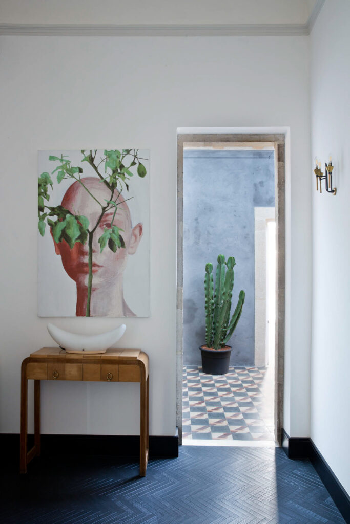
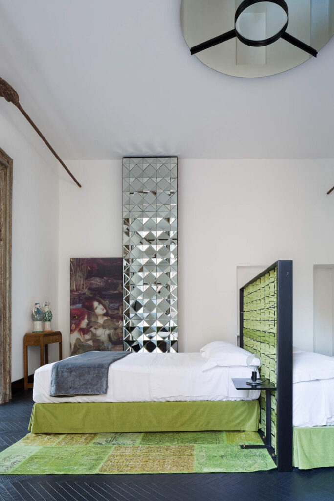
This meant restoring all existing facets of the building—window frames, decorated wood, and stucco and frescoed ceilings—while also installing herringbone parquet wood floors in matte black and reusing the remains of brick concrete discovered in the building’s mezzanine.
Visually, the narrative-driven hotel touches on themes that are dear to the people of Catania, most significantly its patron saint Agata—the muse of the Sant’Agata room. Lushly hued in red and gold to evoke the spiritual, the space indeed feels sacred, while the Colapesce room, awash in blue and coral tones, pays tribute to the legend of a young diver of treasures for 12th-century Sicilian rulers.
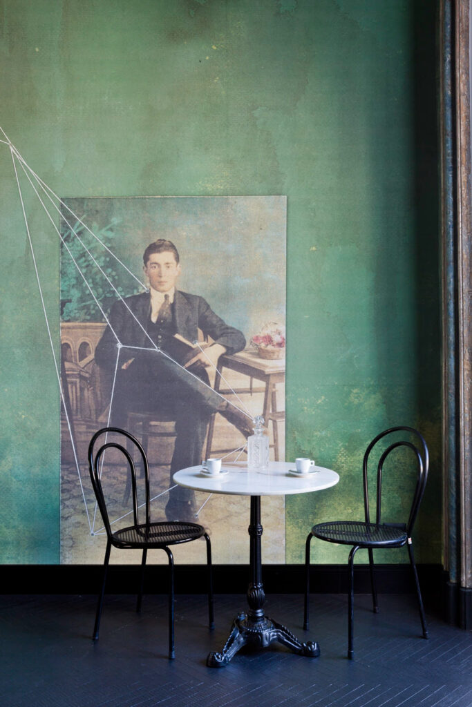
Particularly pictorial is the use of green, a tone that backdrops the barroom and helps recreate an atmosphere of ancient gardens inspired by the mythological figure of Billonia who “handed out flowers and good mood.”
A host of artwork, meanwhile, including a painting by Sergio Fiorentino, a sculpture by Domenico Pellegrino and wallpaper by Swiss artist Daniel Egnéus, completes a vibrant canvas for experiencing a past filtered through the shades of today.
Studio GUM | studiogum.it
Photographs: Courtesy Of © Filippo Bamberghi/Photofoyer; Design By Studio Gum

