A dash of Benjamin Moore’s reinvigorating red Caliente can spice up a home to show its best
Written by Jenn Thornton | Photograpy Courtesy of Benjamin Moore
Caliente is a bold, contemporary accent color that brings different modern dining settings to vibrant life. A little of the color goes a long way, particularly in the interior where white is the dominant hue.
Rare is the color with a more contemporary tone than white—a hallmark of the minimalist home. Still, a curated splash of color, used judiciously, artistically, and in just the right place, can take a home from neutral territory to a more competitive place in the local real estate landscape.
When it comes to trending tones, Caliente—Benjamin Moore’s Color of the Year for 2018—plays into a popular palette of soft pinks, princely purples and ultra-rich crimson on the influential red spectrum, notes Benjamin Moore Color & Design Expert Andrea Magno. “Neutrals are certainly a mainstay,” she says, “but by bringing colors from the red family into the mix, there is a renewed sense of energy.” Caliente is both a timeless and vibrant tone, a red bursting with personality.
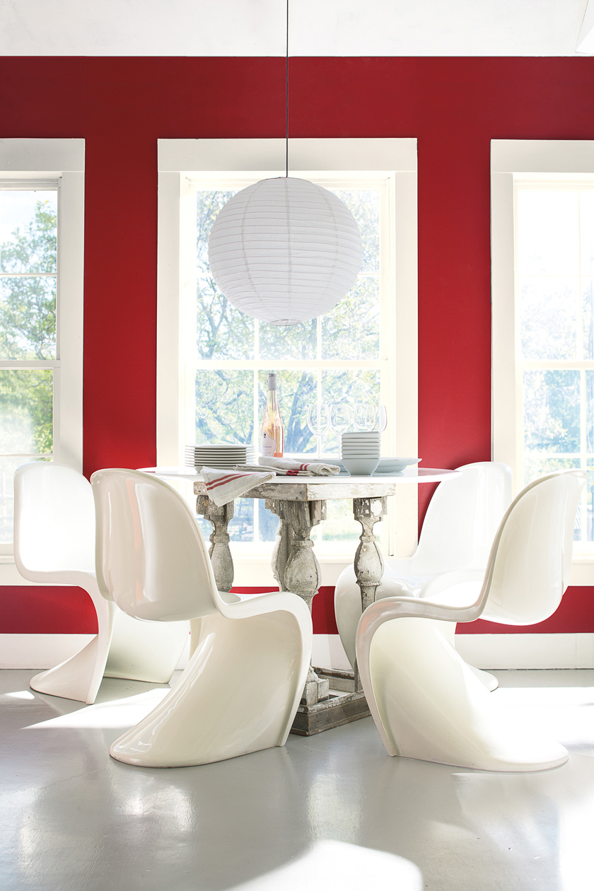
The rich shade is, however, best used sparingly; a suggestion of red typically shows better than a full saturation. “The general rule of thumb for real estate is to use neutral, crowd-pleasing colors that will help potential buyers envision a home as their own,” says Magno, noting that a strong hue like Caliente is exceptionally chic used in small doses, to finish millwork, reinvigorate a kitchen island accented with copper hardware, or disguise a radiator from another era. “A front door freshly painted in red is a classic that can give a good first impression for homebuyers”—a play-it-safe break with the convention of using cool, pale colors.
Interestingly, in Los Angeles, where the clean, white look dominates, even Caliente is not such a tough sell. Says Magno, “Looking to influential architecture of the past served as one point of inspiration for the Color & Design Team, where [we] saw red used as a key color in a Mid-century Modern palette, or it directed the eye in a primarily white interior.” Sometimes the small gesture has the biggest impact.