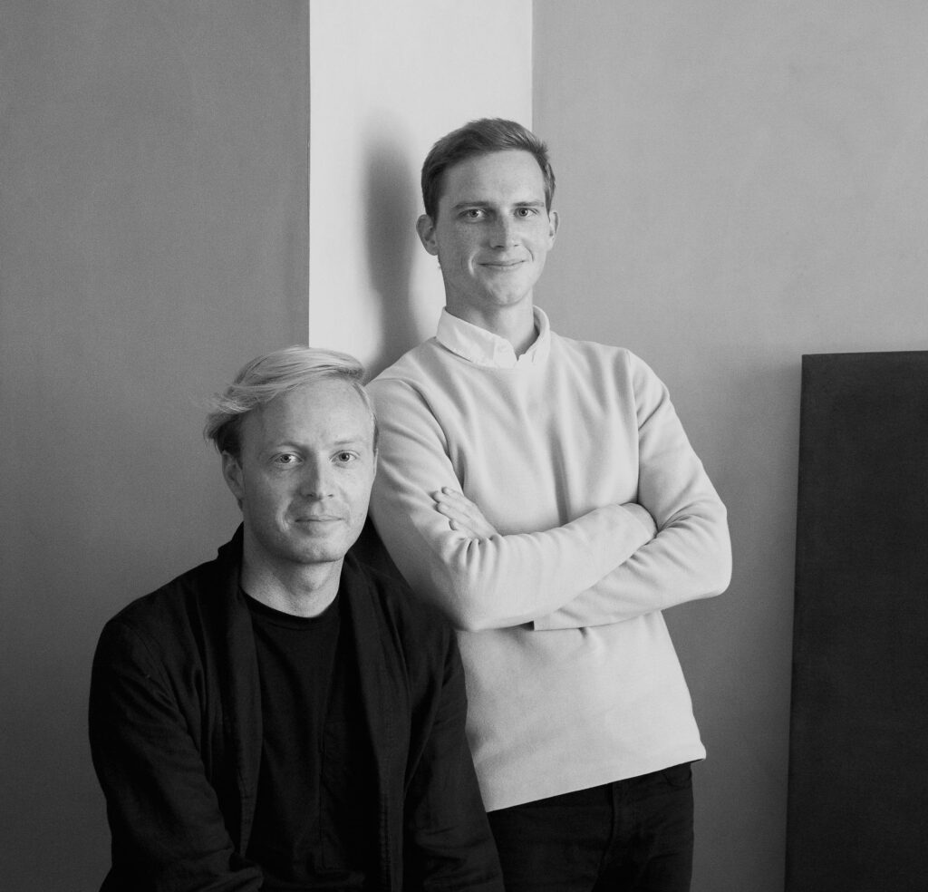
How right that Kinfolk Gallery, a beautifully articulated collaborative and multifunctional space for Kinfolk magazine staff, should have a home in the heart of Copenhagen. The international city’s contemporary design credits are many, admirable and growing by the day—not least Norm Architects, the practice behind the design and a strict adherent to Modernist codes from residential architecture to commercial interiors. Like the firm’s other solutions, the gallery is holistic in its sympathies—for simplicity, for attention to detail, for honest materials and human scale.
In our current design moment, this creed is a culture—the “Kinfolk” brand evokes a kind of design utopia, the rare human-centered balance. Given that balance is the ballast of Norm Architects’ deliberative work, its collaboration with Nathan Williams and Jessica Gray of Kinfolk (along with an array of “co-creators” including Apparatus and Danish design company Paustian) make Kinfolk Gallery the product of a strikingly simpatico design alliance, a shared response between partners of like mind that presents itself as a physical manifestation of the Kinfolk doctrine.
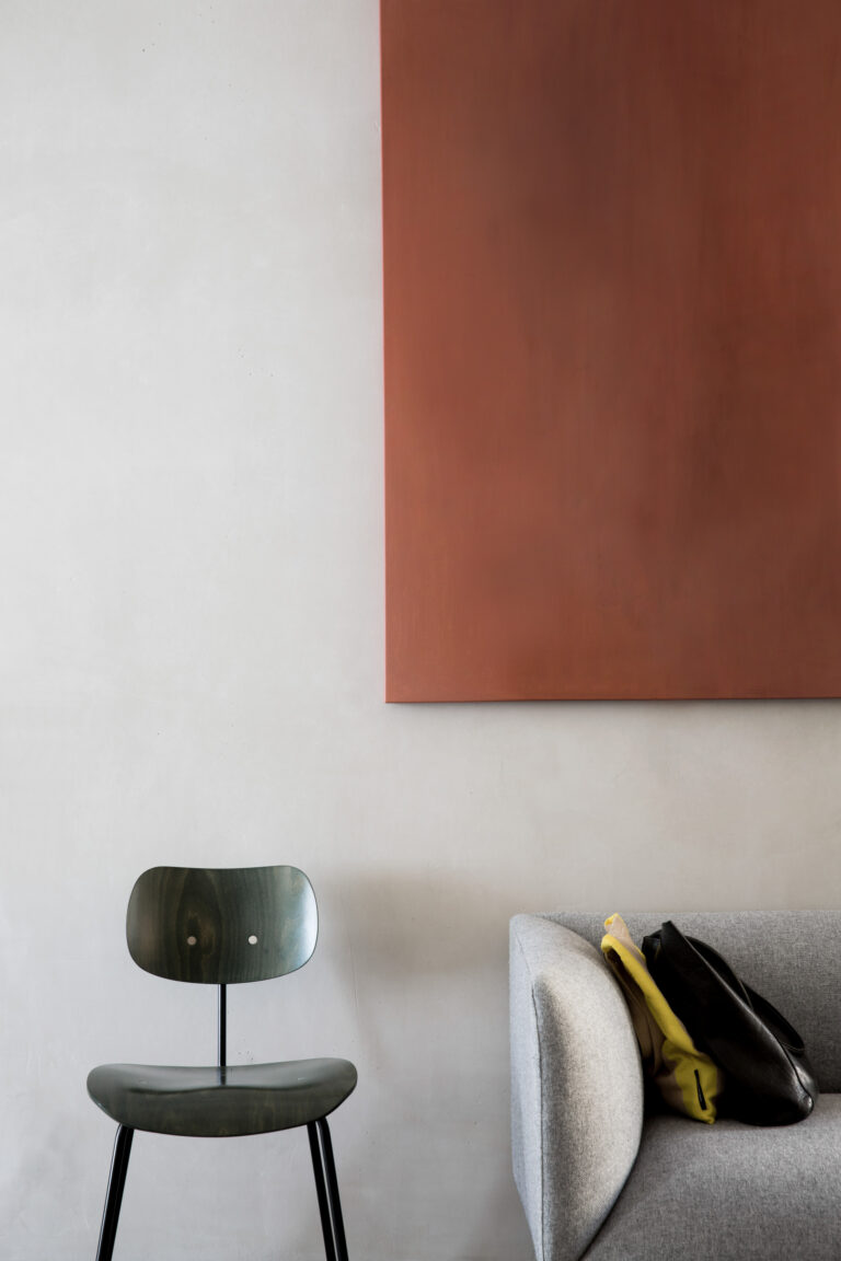
The project’s minimalist, detail-focused treatment strikes a harmonious tone that is both graceful and easy—a mood tailor-made for creative exchange. In this sense, Kinfolk Gallery functions as equal parts salon and showcase, and, in Kinfolk brand fashion, puts forth an unforced and palpable aesthetic equilibrium.
“Much like human well-being, the essence of our work is found in balance—between richness and restraint, between order and complexity,” Norm Architects offers. “Our vision is to look beyond sight. We want to create spaces that feel good in every way.”
The interior architecture of the space unfolds in three zones and was “designed to be bright, light and harmonized in the front area while slowly getting darker and more intimate as you move through a series of narrow door openings that stretch from floor to ceiling, expanding the sense of height in the space,” notes Norm Architects.
From the front end, one moves from the light-filled gallery and gathering space, where one watches scenes from central Copenhagen through large glass windows, to a workspace, to a private back room that, though separate, is architecturally and aesthetically engaged with the overall design.
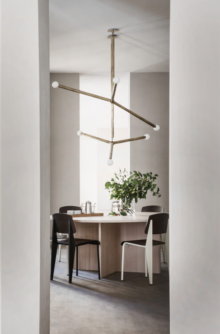
“Every single tone, nuance, and material in the space has been carefully selected to create a harmonious, precise and natural feel with haptic qualities that we felt was well suited for the Kinfolk credo of slow living,” adds the firm.
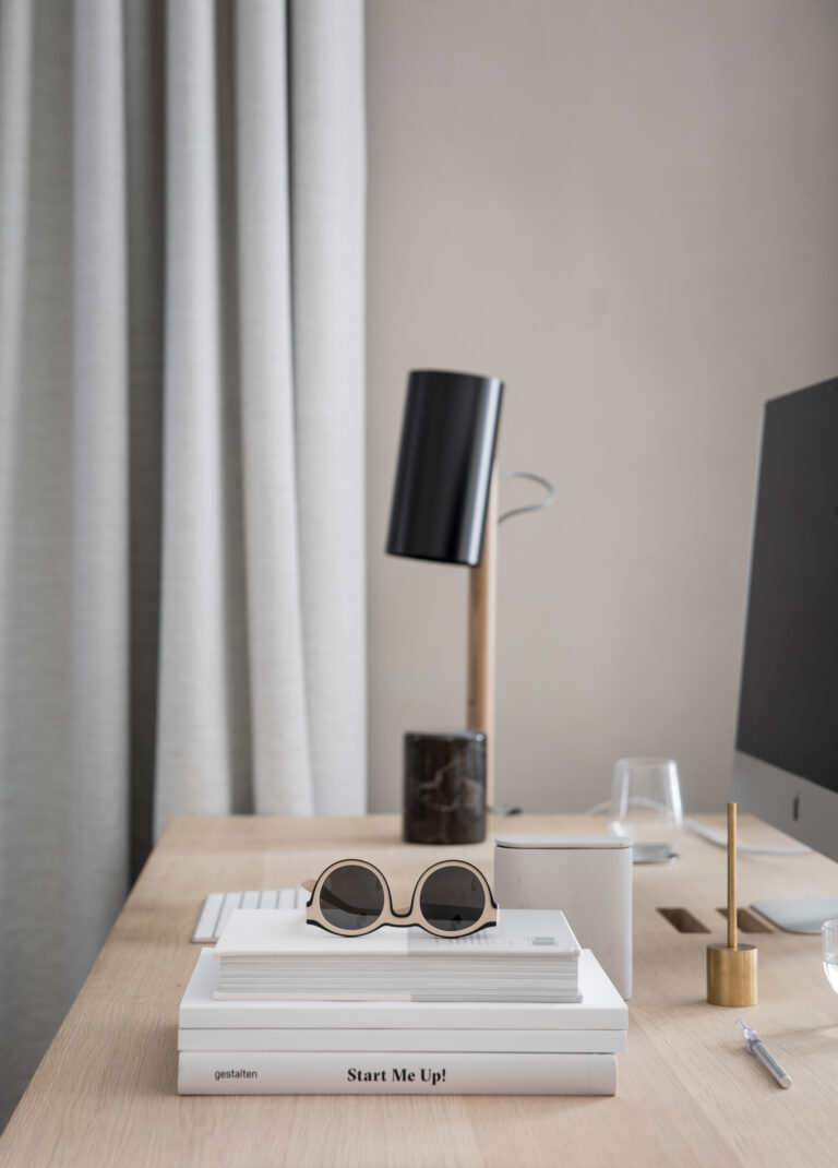
Instrumental to cultivating the highly finished atmosphere are muted tones and a virtuous material palette that together nurtures a soft and settled yet aesthetically rich environment. As a graceful understatement, the project also is one of a natural, earthy warmth featuring walls treated in Kabe, a multifunctional plaster conventionally used castles, temples and exclusive teahouses of Japan, which Norm Architects touts for its special “wabi-sabi quality” as well as for the ways the treatment “mimic the tactility and color of the exterior facades of neoclassical buildings in central Copenhagen surrounding the location of space.”
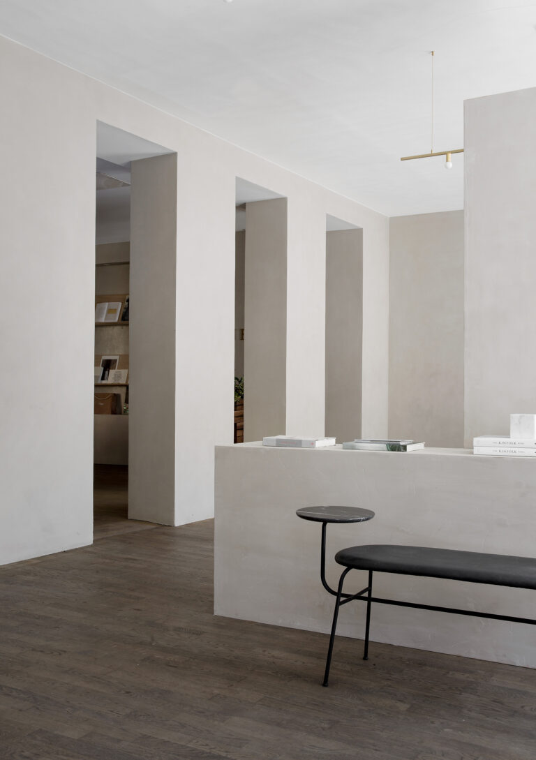
A bench lined in leather, architectural lighting, wooden elements including tables from Dinesan oak, and clouds of ethereal gray draping is among the supporting elements. A series of small nooks and niches, meanwhile, were “created to clean up existing irregularities in the space and use them as an advantage to create surprising views and details in the architecture.”
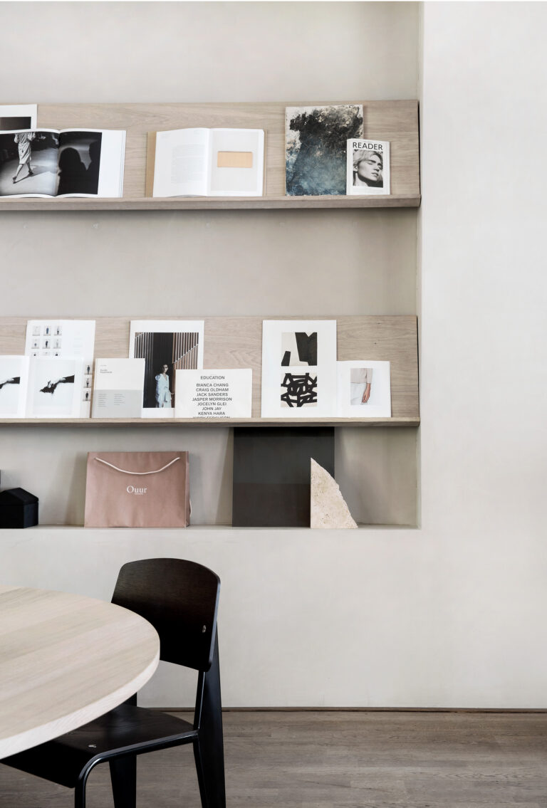
Among these is a generous cubby fashioned after a Japanese tokohoma; a virtual cradle is large enough for one to cozy up to attend to a burst of creative energy or indulge a contemplative moment. The reception area, meanwhile, upends the typical office hub with a more welcoming living room effect fostered by the appointment of contemporary wall shelving with artistic material and a large round table in the center of the space that announces a social element. Unmistakable is the parallel sensibility that emerges from the synthesis of inspirations and influences from Scandinavian and Japan.
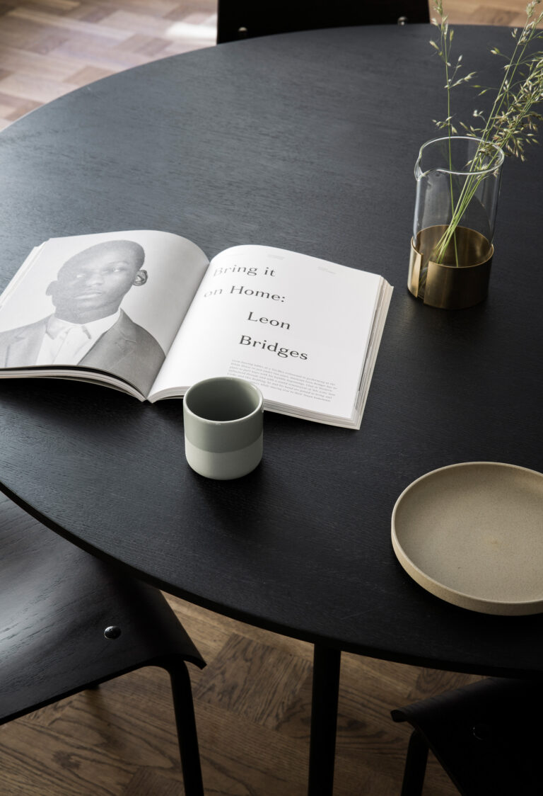
In making a series of carefully considered calculations, Norm Architects created a built environment of surprising exactness and order that, like an issue of Kinfolk, makes a case for the logic of pure clean lines and contemporary thinking. Kinfolk Gallery is a thing of beauty on its face, but also for how effortlessly it manages contradictions—here is a space that is strict but not severe, nuanced yet flagrantly modern.
Norm Architects completed Kinfolk Gallery with a tidy summary of its work, deeming it “elegant, sophisticated and crisp.”
It is a description of no real fanfare or affectation, but it doesn’t need to be. A practice, a project and the simple, beautiful truth that results—there is no greater audacity.
Norm Architects | normcph.com
Photographs: Courtesy Of Jonas Bjerre-Poulsen, Founder And Architect Of Norm Architects


