In this vast Massachusetts house, Sashya Thind—the founder of ID8 Design Studio—used the owners’ art collection as the starting point for transformation
Sashya Thind launched her career and pursued life abroad, first in Dubai, where she interned while getting her architecture degree. She then lived in England for two years and worked for an urban planner on housing projects, while traveling around Europe.
Since 2007, Sashya Thind has called Boston home and here she started her firm, ID8 Design Studio, in 2012. Since then she has developed her own approach and aesthetic that she describes as warm minimalist, nurturing creativity drawn from the rich experiences of her past. “This philosophy sets the framework for my design thinking,” Sashya Thind explains. “It’s tactile and textural while being mindful of not subscribing to a throw-away culture.”
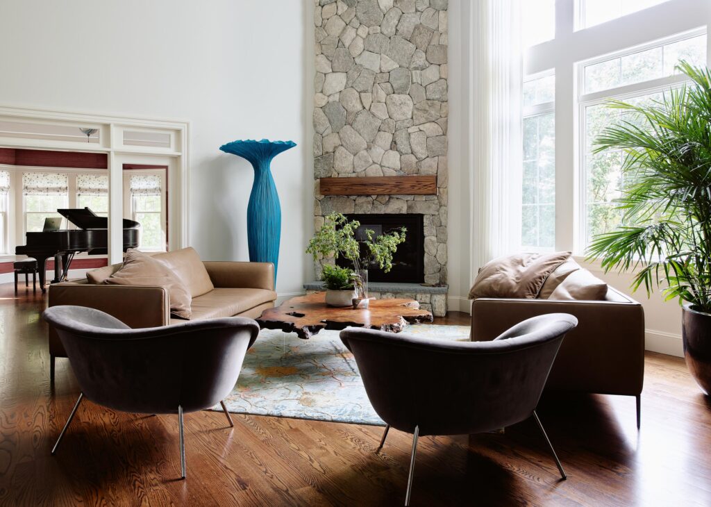
Even if warm minimalism is the common thread, Sashya Thind considers each project unique. “The client, the location, and the architecture are the biggest inspirations,” she says. “I work toward creating an honest reflection of the clients, which is an intuitive, immersive and intimate process.” Case in point: This 8,000-square-foot, three-level house with an open plan living room and six bedrooms located in Weston, Massachusetts. The tall ceilings, an abundance of natural light, and expansive spaces immediately inspired Thind.
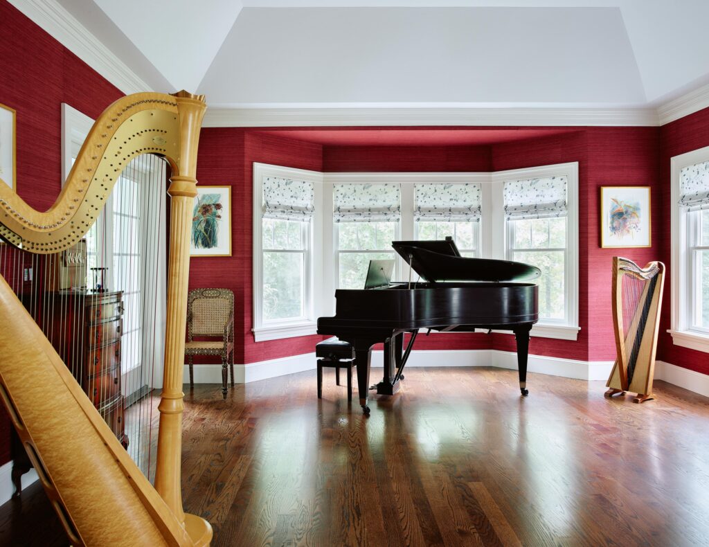
“The owners are a young couple”—Jenny, a harpist and Alex, who works in finance, and both art and design lovers—“that wanted to work with me to transform their home in a sensitive manner as they were relocating from a historic Victorian home to a developer style new-build that needed character,”
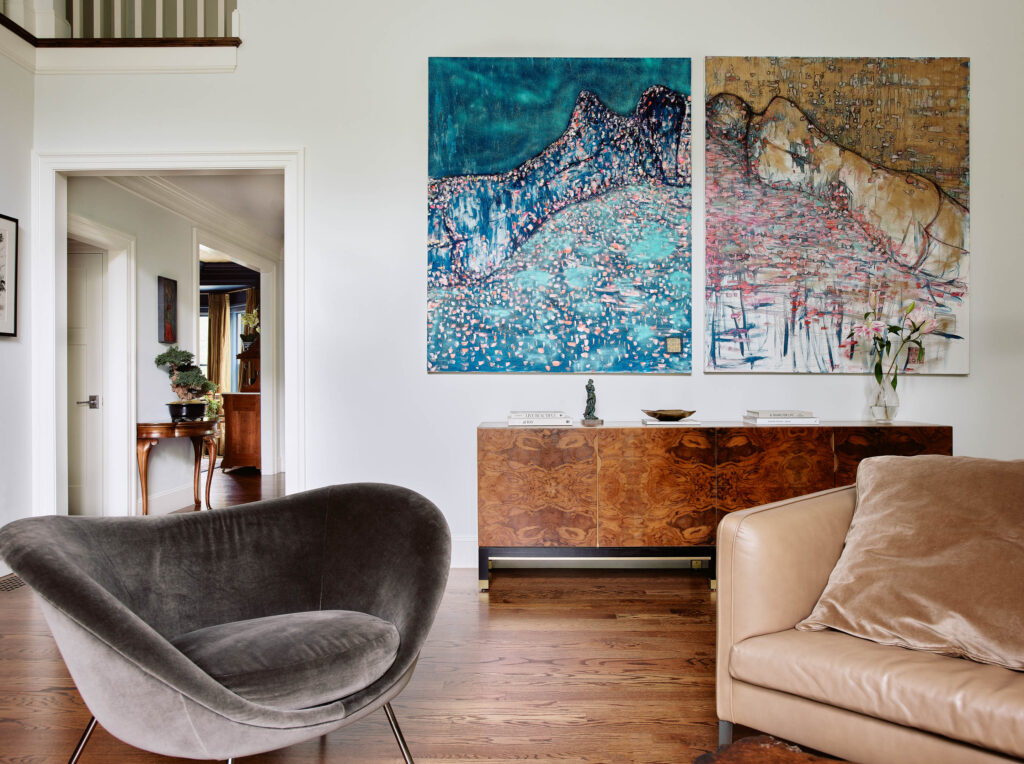
Sashya Thind remembers. With furniture by Gio Ponti, Vincent Van Duysen, Kelly Wearstler, and Lawson-Fenning—among other names—and artworks by artists such as Morgan Everhart, Pierre Fraiture, Danielle O’Connor Akiyama, Léon Esperance Broquet, and Susan Maxfield, the owners’ extensive collection was a very important source of inspiration for Thind.
“This project was a true study on how art can transform a space,” she says. The interior designer chose a palette that would integrate all these pieces into different areas, creating moments that are reminiscent of the dwellers’ previous home while embracing the architectural qualities of their new house.
“I chose a variety of colors,” Sashya Thind says. “The expansive spaces are white dove to feel illuminated in the natural light, while the other rooms with different ceiling heights were given personalities through the use of a strong wallpaper or paint to bring out the details further.”
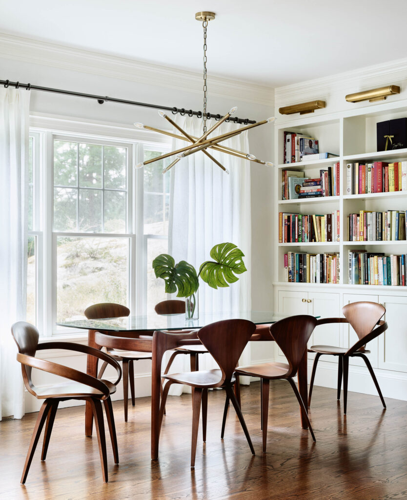
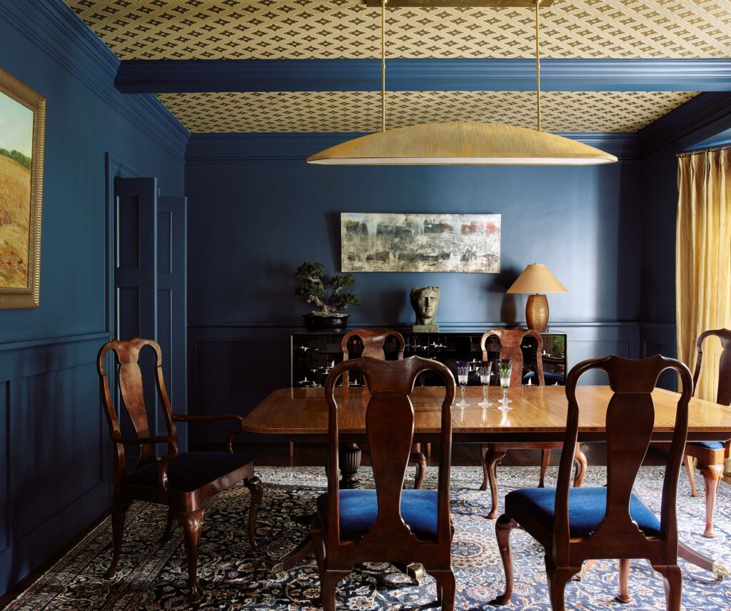
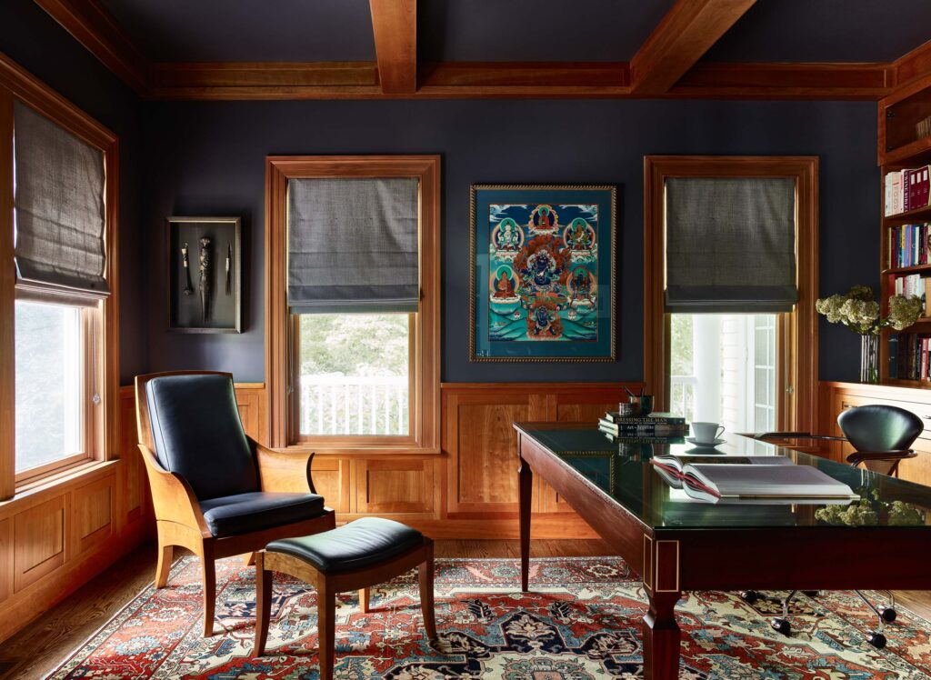
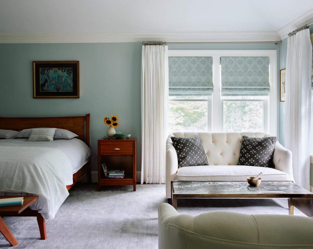
For example, the music room—where Jenny performs with her harp—has a Phillip Jeffries grasscloth in a rich rani pink for a more feminine feel. The study and the dining room were painted a deep Farrow & Ball Inchyra Blue to highlight the moody nature of the spaces. Furnished with a vintage Philip and Kelvin Laverne handcrafted brass coffee table and a Chilton bench, the master bedroom features serene tones, with a soft green paint that complements Jenny and Alex’s existing furniture, including the Vermont Woods bed and nightstands.
One of Sashya Thind’s favorite elements is the custom credenza in burl wood she designed in collaboration with Mark Brunke to bring visual texture and “something that could be an heirloom piece for their family,” she describes. “In the furnishings, I used live edge wood, walnut, brass, leather, velvet, linen, cut velvet, and grasscloth on a few walls. I enjoy bringing in texture through upholstery—usually a solid which feels luxurious to me.” These materials add a modern organic feel to the house while sculptural elements throughout enrich the visual story.
All the corners and areas such as the family room host surprises: “It’s a composition of bold, playful pieces that sit perfectly in an expansive volume of space,” Sashya Thind says. “I wanted to create an atmosphere that inspired the dwellers every day. There are moments in every space that catch your eye while being an integral part of the whole. I like to design spaces that have interesting details but can be experienced in their entirety as a composition. There is no one thing that overpowers or diminishes the other. It is a balance of aesthetics, sculpture, and materials.” id8designstudio.com
Photographs: courtesy of Jared Kuzia Photography
