
A refreshing and revitalizing shade, Pantone’s 2017 Color of the Year lends both personality and peacefulness to a space
Each year, the Pantone Institute chooses a symbolic shade that provides a color snapshot of what’s occurring in our culture at a particular moment in time. This year’s Pantone Color of the Year, Greenery, has long been a popular option in warmer climates such as L.A., and in outdoor spaces. But now, the fresh and zesty yellow-green hue also is beginning to make an appearance in other areas of the home, along with hotels and residential communities. From its use in everything from home décor to architecture, the tone is becoming a go-to source for evoking the first days of spring, when nature’s greens revive, restore and renew.
According to Leatrice Eiseman, Pantone’s executive director, while Serenity and Rose Quartz (Pantone’s 2016 Color of the Year) expressed the need for harmony in a chaotic world, Greenery symbolizes a reconnection with nature, one another, and a larger purpose.
“Greenery is a bright, energizing color we’ve seen many projects starting to incorporate into their design,” says Carson Norcross, president of Westlake Village-based Norcross Furniture Co., whose company has created numerous items in this shade. “Outdoor furniture has always skewed brighter, but now clients are using the color in lobbies and dining areas. The sky’s the limit. When working with creative interior designers, it is fascinating to see what they design, imagine and create.”
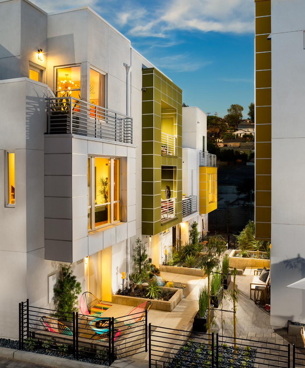
According to design director Jeff Cooley of CDC Designs—which worked on Trumark Homes’ new SL70 residential community on Glendale Boulevard in the hip Silver Lake neighborhood—the fresh shade of green is experiencing broad appeal because it is bright, fun and has a great energy. At SL70, many hints of Greenery can be found in the community’s exterior accent walls, along with the interior décor.
“It contributes to the idea of bringing the outdoors inside,” says Cooley. “With that indoor-outdoor feel, it adds an important freshness and brightness. By bringing that color inside, you’re bringing harmony between the two areas and experiencing that same feeling of zest. When the weather isn’t good, it can help to brighten up a room.”
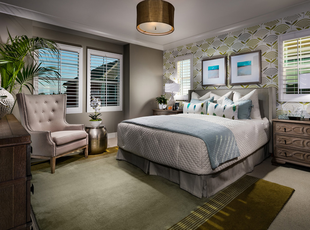
Because the color is found in nature and very transitional, Cooley and his team tend to mix Greenery with varied shades found across the board—from cooler blue and purple tones to warmer reds and oranges, and even neutrals such as gray or white.
“The first place we usually go for inspiration is fabrics,” he says. “If you want to incorporate the color by itself, you can use it to paint an accent wall, but it’s such an intense color; a little bit goes a long way. It is also a color that can easily be brought in with artwork, pillows or accessories.”
Adds internationally recognized artist and designer Pablo Solomon: “This color was popular in the 1950s and ’60s. With the big trend in mid-century modern, this just fits in perfectly. It also works well with the trend of having a harmonious flow between interior and exterior living and décor.
What we see is that homeowners like the color incorporated in fabrics and décor. They also are asking for laminates using this color for mid-century modern style built-ins like desks and shelves.” Get your green thumb ready…no matter what way you color it, this life-affirming shade is ripe and ready to blossom.
Photography Courtesy of Trumark Homes