This house’s concept was born during the tail end of a family trip, on the way back from Mexico to Canada. While flying, Ben Leavitt—interior designer and creative director of PlaidFox—and Sarika—Leavitt’s sister-in-law—simply drew on a napkin how they would envision the ideal home, where every family member would feel at ease in an environment filled with visual surprises.
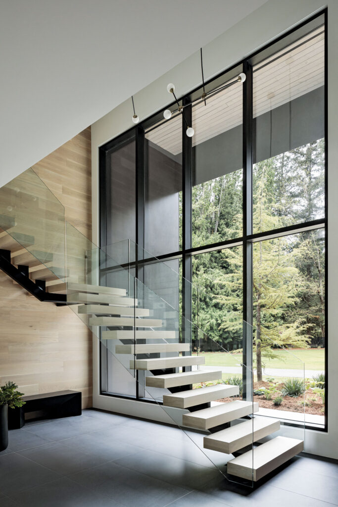
Located in a forested area outside of Downtown Vancouver, on the West Coast of Canada, the 8,000-square-foot residence is spread across two floors (with most of the square footage on the large, open main level). With its six bedrooms and eight bathrooms, the house—which was finished in 2021—took around two years to complete.
With nearly no interior walls on the ground floor, one of the biggest challenges for PlaidFox consisted in finding ways to delineate the different spaces, which was achieved through the introduction of hints of color in each area.
“In the living room and the bedrooms, I used more earth tones, including rust, dark blue, caramel, ochre and tamarind, while in other areas I opted for more bright and cheery tones, such as the dining nook adorned with orange, pink and seafoam green,” says Ben Leavitt.
Meanwhile, white oak is used throughout to connect everything. It pairs well with the kitchen and bar painted in Raccoon Fur by Benjamin Moore (a slightly lighter shade of black with a touch of inky violet).
Despite its large size, the house feels cozy and warm, thanks to the presence of natural textures such as wool. Instead of following a specific aesthetic, Ben Leavitt explored how several materials, colors and textures would come together along the way, fine-tuning every detail over the period of construction and leaving some space for unexpected and bold choices.
Among some of Ben Leavitt’s sources of inspiration for this project are Montreal and Vancouver, “two cities that really interpret modern in a livable way,” he says.
In addition to these Canadian influences, references to Scandinavian (and more specifically, Danish) design also contributed to the minimal look that is complemented with whimsy elements, such as the singular white chair among the black seating in the dining area, the sculpture made of stacked ceramics in the breakfast nook and the tiger artwork above the bed, to name only a few.
In the living room furnished with a custom white curved sofa, a faceted coffee table from Noir, a black Roly Poly chair by Faye Toogood, a Parc light fixture in terracotta by Lambert & Fils that evokes the woods and looks a bit like a flashlight, a wet bar with tiles from the Puzzle series by Mutina and a Kashan chair by Bernhardt, the star of the show is an artwork made and gifted by Ben Leavitt to Sarika as a nod to their experience during the project.
Titled “Hold On Let Me Overthink This,” it humorously refers to the doubts the homeowner had every time the designer was showing her some ideas about the project. In the end—after weeks of reflection—she would always agree on what he had initially suggested.
This playful home—which “doesn’t take itself seriously” according to Ben Leavitt—is the perfect mix of a modern artistic approach and functional family living. Youthful and inventive, it combines the classic with the minimal for a very personal result that tells the story of its inhabitants and the people who worked on it.
PlaidFox | plaidfox.com
Photos: Ema Peter