A Contemporary Southern California Showpiece Combines Spectacular Views and Tour-de-force Interiors by the Wiseman Group
In the 40 years since its founding by Paul Vincent Wiseman, Bay Area-based interior design firm the Wiseman Group has completed a breadth of remarkable work. Its projects are reliably wondrous and highly prized set pieces of thoughtful interior design—authentic and sophisticated, with an identifiable relationship to both client and environment.
Some, like this vast, roughly 11,000-square-foot spectacle, bring a new dimension to a firm we thought we knew.
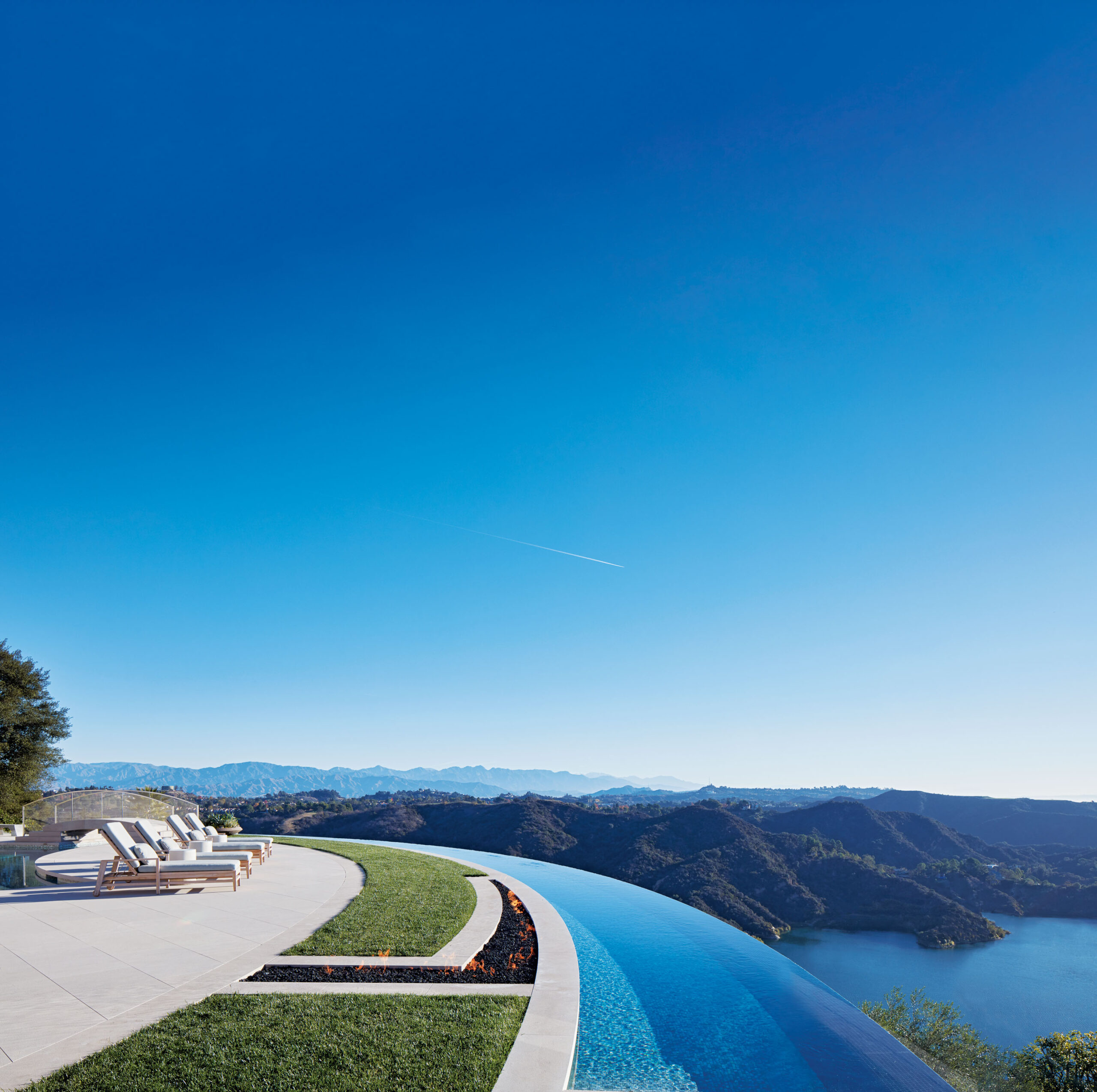
“Architecturally it’s a view house, everything is open to the view,” says Paul Vincent Wiseman, who worked on the project in concert with architect Landry Design Group. “Sometimes you need to turn around and look back because the view can be overwhelming.”
Therefore, he adds, “We very carefully designed our rooms so that from every room you can enjoy the view, but there is an intimate comfort whether it was the primary bedroom, family room or playroom. The colors are very bright and cheerful like the LA skyline. You could be by yourself in the house and not feel overwhelmed as the spaces are not too big. There is a comfortable place to be at every turn.”
As work of architecture and design, the house is distinct yet illustrative of TWG’s ethos in that it follows, as Paul Vincent Wiseman puts it, the “Three rules of decorating: appropriateness, appropriateness, appropriateness. The architecture is appropriate for LA, the interiors are appropriate to the architecture, and the comfort and style is appropriate to the client.”
If the house has a defining feature, it is connection, between the interior design and the architecture, and a fluidity of the alignment between the furnishings and architecture.
“The glass bricks of the front door line up with the stone bricks of the wall,” Paul Vincent Wiseman points out. “The embroidered lines of the drapery line up with the architectural spacing of the moldings of the windows.”
The architecture itself is a masterstroke, particularly where it concerns the home’s curved limestone walls, which are utterly spectacular. Lines are sharp, forms are soft, and light is welcomed.
Exterior and interior alike is a credit to the influence of Japanese architecture and culture. Yet despite its strong sense of uniformity, the space is also strikingly original. In keeping with the clients’ interest in age-old Japanese elements, decorative touches include a collection of Japanese bronzes and pillows based on the tradition of obi embroidery. These are subtle gestures of an aesthetic, filtered through a contemporary lens for a fresh take on tradition.
More overt examples include upholstered origami panels in one of the powder rooms as well as origami-formed walls in the luxurious home theater. Meanwhile, found objects previously lost to time, such as the 80-million-year-old fish fossils worked into in the home’s spa powder room, were given new life in a modern context.
The art throughout the house is vibrant and animates calm corridors and quiet walls. The works were not chosen randomly, but picked and purchased by the client, with Wiseman and TWG’s design director, Brenda Mickel at Art Basel Miami.
“The clients chose the art,” says Paul Vincent Wiseman, “but we provided editorial guidance as to what worked with the house and what didn’t, so it was very personal to them.”
All pieces in the house, from the found objects to the personally curated ones, add a layer of depth and interest to the interiors. Hand-woven wool-and-silk carpets, for example, as well as linens allied with features in the architecture, all serve to harmonize the interior. As a material, cast glass is used widely, taking bold shape in sinks and shelving in the powder rooms. It is also used, oh-so-memorably, for the staircase that descends over the pool in truly magnificent fashion.
For a house of such exquisite elan, perhaps the highest compliment one can pay Nouveau Modern is the unforced nature of its decoration. Make no mistake—this is a highly stylized house.
And yet, Paul Vincent Wiseman’s words of “appropriateness” ring elegantly and unambiguously true. Nothing is out of place, zealously picked or proven wrong as a decorative solution. The spaces, and the scale, are theater; dramatics are in the details. The fine pointed legs of a chair. The showstopping chandeliers.
If every element of the design tells a story, and Paul Vincent Wiseman assures that it does, then Nouveau Modern is not unlike a lot of high-end Southern California residences. Perched on a hill. Enthralled to a dynamic view. Spacious and open to its outlook.
But if Paul Vincent Wiseman were telling the story, that narrative is, like his interiors, refreshingly different: “LA, but not cliché.”
Paul Vincent Wiseman | Wiseman Group | wisemangroup.com
Photos: Roger Davies Photography