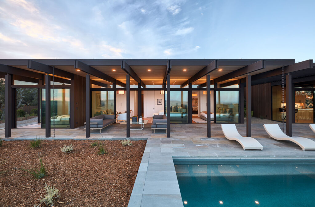
Molded by Its Immersive Environment, a Low-slung Sonoma Valley Residence by Klopf Architecture Brings Mid-century Modern Design Into the Current Moment
Set atop a boulder-strewn hill in the wine-growing capital of Sonoma, California, a strikingly horizontal residence by San Francisco firm Klopf Architecture keeps a low profile. It does not, however, escape notice.
Then again, it couldn’t possibly. With a flat roof and wood-beam exterior interspersed with vast expanses of glass that open the 4,068-square-foot structure to the landscape upon which it lightly sits, the edifice calls to mind the iconic mid-century modern form—one iteration of it specifically.
“We had previously worked with the homeowners to remodel and update another mid-century modern home they owned in Sonoma,” say the team from Klopf Architecture, including Principal Architects John Klopf and Geoffrey Campen, Lead Designer Ethan Taylor, and Designer Noel Andrade.
“As their needs outgrew the house, their aspirations grew alongside. They approached us once again, this time to design a house that was inspired by the original but on a much grander scale to support their space and layout requirements.”
That the homeowners love mid-century modern style, they add, “It was important for the new house to eschew the rhythm of the post and beam construction style with a more modern and minimalist sensibility for which we are known.”
Klopf Architecture’s residential work, which includes designing modernist homes and renovating modern and mid-century homes, bridges modernist design with technical understanding to create aesthetically dynamic and resilient residential infrastructure suited for our time.
A hallmark of this project, for example, is Klopf Architecture’s use of exposed beams that travel from interior to exterior, emphasizing the structure’s indoor/outdoor connection; its decision to employ “rain chains” in lieu of frumpy downspouts that rob sleeker architecture of its clarity and crispness is a move more in keeping with today’s modern homes.
Taking the hilltop location and valley views into consideration, the firm’s low-lying design, which does not extend vertically beyond the trees on the site, is meant to complement a terrain dominated by Sonoma’s rolling hills. The architecture itself features an earthy palette that grounds the structure into the landscape while its cedar-stained exterior, intended for warmth and timelessness, furthers blends house and surround.
“Extending the same materials from the interior to the exterior, as well as the large floor-to-ceiling openings, are ways that we like to de-emphasize the threshold between inside and outside,” the team says of their approach. “This is a modernist methodology that we employ in most of our designs where boundaries between the structure and its surroundings are blurred.”
The result is a dwelling with an easy and exquisite rapport between realms.
Inside the home, living and private spaces are aligned along the axis of its primary view—a magnanimous outlook stretching from the San Francisco Bay Area to Mount Tamalpais to the Sonoma Valley—with mammoth sliding glass doors that extend the interior outward. Flow is the pervasive feel.
Liberated from constraints, the open concept’s living, dining, and kitchen areas stream seamlessly into each other. From the great room, which is backdropped by a breathless vista, one floats, without notice or calculation, out to the covered patio area with additional outdoor dining and living areas, an infinity pool, and the horizon beyond in a transition that is as graceful as it is reflexive.
Private bedroom areas, meanwhile, take shape as individual suites or, more to the point, escapes, with bedrooms, reading rooms, closets, and baths. Floor-to-ceiling glass opens at least one slumbering chamber to the hum and beauty of nature while still providing the space privacy.
Every aspect of the home’s organically drawn interior design is meticulously considered for a low-key California chic. Highlighting warm natural tones and refined yet unpretentious materials, from white oak to Calacatta marble, the well-edited interior marches to the beat of modernist doctrine, combining contemporary furnishings, a few fantastic lighting fixtures, and a handful of memorable art pieces with discipline. Decorative drama finds no audience here; views are the spectacle.
To that end is Klopf Architecture’s use of glass, employing the material as pristinely and strategically as a surgeon, making cuts in the façade to highlight and leverage the landscape, capturing it as not merely something to see, but to experience throughout. Quite memorably when it comes to the outdoor rock garden. Infused with a sense of Zen and hypnotically lit by sunbeams spilling through slats in the roof, the alcove evokes a mid-century modern staple: the courtyard.
The rest of the exterior landscape is similarly minimal, marked by resilient plantings that can withstand the dryness and heat of wine country climes while mimicking the shrubby natural setting.
“We were successful in allowing the architecture to highlight and focus on the surroundings more than anything else,” the architects say in their final appraisal of the project.
One that is best understood as a response to, and reflection of, the broader environment—bringing it beautifully into view.
Klopf Architecture | klopfarchitecture.com
Photos: Mariko Reed