Table of Contents

A Graceful Spanish Revival Home is Expanded and Enhanced for Modern, Beachside Living
Inspired by the popularity of the Panama-California Exposition of 1915 held in San Diego, which shone a spotlight on Spanish architecture, many new communities that sprang up in Southern California during the 1920s and beyond were designed with the style in mind. Today, the look has become so popular regionally that its categorization as a California classic is justified.
It’s always nice to see the evolution of a traditional style, not just updated with the latest materials, but with a reworking of look and floorplan that satisfies modern-day living. Such is the case of a significantly revamped home along a Manhattan Beach walk street, steps from the beach and the pulse of downtown.
“I would call it Spanish Revival, it had some Old World charm to it,” says architect Douglas Leach of the original home.
Doug Leach was the architect on the project, while Matt Morris was a consultant, putting forth the ideas to overhaul the property.
“The overall goal was to open up the house and the flow of the house,” says Matt Morris of the redesign, which was completed last year.
Reimagined for Today and Tomorrow
Now framed by leafy palms, the creamy-white exterior of the residence— three floors in all and approximately 5,000 square feet of living space— retains only select signatures of its Spanish origins, from clay tile roofs and arched doors to charming balconies and an iron-rail stairway.
“Some of the bones of the home were here,” points out homeowner Catherine Bigler, “but it needed to be updated and expanded.”
The result is an evergreen family home that could comfortably and stylishly be inhabited for decades.
“This house is ideal for a family or a person who wants a lot of space to entertain. It’s the perfect floorplan,” says realtor Ed Kaminsky. “A multi-generational family could also find it appealing because of the separation of spaces.”
One can room on the ground floor, which is also decked with a media room, a study and an au courant kitchenette and eating space. The floor neatly opens onto a fresh-air lounging patio that connects to the walk street, which makes for an easy shuttle down to the beach. While the adults usually entertain on the home’s top level, the ground floor is a favorite for children, who like having their own space.
Meanwhile, the middle floor houses four bedrooms, including a sunny master with a slender balcony—a handy configuration for families with young children.
Opening Up the Space
Arguably, the heart of the home is found on the top level, which was reconfigured by Matt Morris as an open floorplan, full of pretty vistas and encompassing the kitchen, dining and living room.
“Instead of having little, smaller, sectioned-off rooms,” says Matt Morris, “it was about opening up space and having more of a truly dedicated open space. And making it more useful, with a flow.” Matt Morris also advised on how to make way for more outdoor views. As a result, blue sky and water scenes have been capitalized on by virtue of strategic window placements, from oversized picture windows to slender, step-out balconies that reach almost to ceiling height.
“It has sunshine all day long,” says Catherine Bigler.
The kitchen area is centrally placed and anchored by a wood island topped with concrete. Along one wall is a sleek row of frameless white cabinets set against a shimmery mosaic backsplash, which contributes to the uncluttered, minimalist look of the well-equipped kitchen, where much of the appliances are cloaked behind the smart design.
“We really wanted to keep everything streamlined,” says Catherine Bigler, opening up an innocuous white door to reveal a refrigerator. Nearby, tucked away is a wine closet.
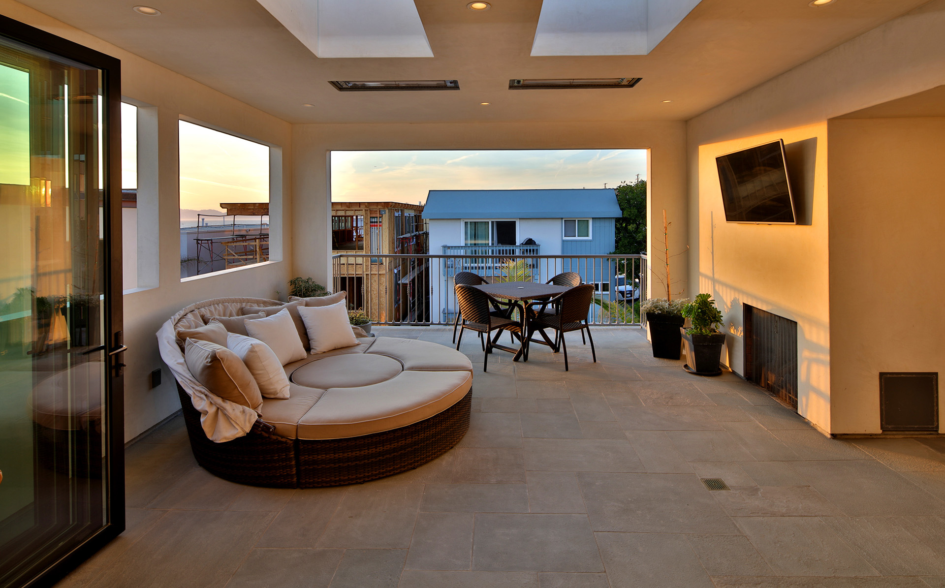
Also on the top floor is a separate lounge, one that neatly expands into an outdoor living area by way of a receding glass wall.
“We created the covered outdoor living space on the north side,” says Leach.
“These covered outdoor spaces have become very popular, very desired. I think it worked out well.” This newly realized section of the home is complete with a grilling station, heat, and sound. It’s also blissfully private, hidden from street and walkway passersby not just by its height, but also by its placement, partially within the home’s round tower—another Spanish signature of the original home.
Sand, Strand & Downtown
“Our favorite part of the house is the top floor because it’s indoor-outdoor living,” remarks Catherine Bigler. “And the location we picked specifically to be able to go downtown and go to the beach with the kids. It’s ideal, we walk everywhere.”
Though the ability to open up the door and hit the beach, restaurants, and shopping is a major plus, another highlight, particularly in Manhattan Beach’s downtown area, is the home’s five-car parking capacity, a perk that has been grandfathered in.
Step outside, and it’s an easy amble to reach the sand, or a five-minute walk to find yourself amidst the mellow buzz of Manhattan Beach’s downtown boutiques and eateries. Yet the home’s interior, quiet and spacious, with oak-plank flooring settling against soft-white walls and windows shuttling in scenes of blue sky and ocean, is a pretty good place to be.
“Watching the sunset here every day is the best thing,” muses Catherine Bigler, standing in the still of the top deck, with a front-row view of blazing orange and red sky settling into the Pacific.
Ed Kaminsky | Ed Kaminsky Real Estate Group
Itzsold.com
Photography by Paul Jonason