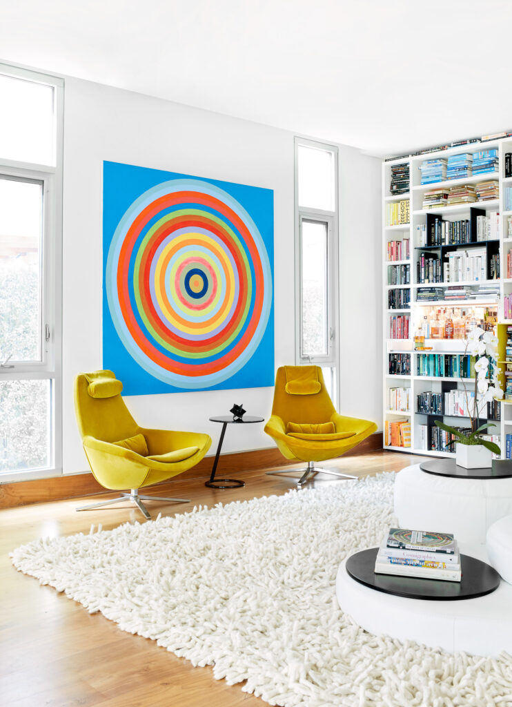
In the center of Los Angeles, interior designer Kerry Vasquez creates a kaleidoscope of color for a young couple

Married couple Marina and Dan didn’t hesitate to move from their previous 670-square-foot, one-bedroom apartment in Santa Monica to this 4,100-square-foot home in Westside Los Angeles. Both working professionals, they wanted a place with energy and space to entertain.
According to interior designer Kerry Vasquez, the couple approached the project holistically and had a very clear vision with design goals: “Dan wanted to create a cool, modern, and exciting space while still being tasteful. Something with a light, open, contemporary feel, playful but stylish, a bit imposing but with human touches.”
Flow is one of the most important aspects in this home. Being able to move throughout the space, experiencing it as a unified whole while also seeing separate areas that allow for alone time or small group conversations, are at the heart of the concept. The same is true of the owners.
“The clients were extremely hands-on,” Vasquez says. “Dan has such a passion for the creative process and Marina’s main objective was that everything be functional and comfortable.
They made an incredible team to collaborate with!” While the backdrop of the house is white and linear, the furniture and art introduce vivid colors to every corner: yellow bar stools, a purple Roche Bobois sofa, and artworks by Robert Levine, Kelly Berg, and José Alberto Marchi, among others, populate the space. In the living room, a floor-to-ceiling Poliform wall system houses the couple’s impressive book collection organized by color. “I immediately realized this project would be about the play between the circle and the line, and the use of color and lack of it,” Vasquez says.
“As Dan is a pioneer in the tech world, he naturally wanted to use tech-forward materials such as the Techno 2D, 3D or 4D fabric found on the Bubble sofa and chair from Roche Bobois. Detail and texture were also key elements, best exemplified by the hand-stitched wallpaper from Tracy Kendall in the foyer.”
Bold hues adorn the downstairs space, while upstairs, Vasquez toned down the use of color. As a result, one of the guest rooms is black and white, and the second designed around a blue silk Calvin Klein rug from Modern Rugs LA. “In the master bedroom, Dan originally had orange sheets, which I vetoed because I am a firm believer that bedrooms should feel serene,” Vasquez confesses. “However, I wanted to honor his love for orange and thought we could create a peaceful vibe if we used the natural version of it: copper.” Sconces from CB2 and the Swole side table from Blu Dot are some of the other elements that adorn this space.
“I think it’s my favorite room in the house now,” Vasquez says. Drawing inspiration from the Bauhaus, the interior designer also combined her minimalist approach with the owners’ maximalist aesthetic throughout the whole project.
“It was the biggest challenge but it also ends up being the best part,” she admits.
Photographs: Courtesy Of Sara Tramp